Mine is the good one
I love this picture of my parents, siblings, children, nephew, and nieces.
I always love any pics of the cousins together, but you’ll notice one kid has had ENOUGH of the paparazzi, and another is apparently trying to escape.
And then there’s Louisette, who usually looks like she’s just been punched, but here looks like a smugly-smiling child model.

ARR ME HEARTIES!!!
The long weeks at sea have dragged by as the scuttlebutt is whispered from captain to cabin boy… there’s going to be a post-comp release of SCARLET SAILS… it’s twice as long… there are new chapters… there are even more chances to stab, shoot, or magically murder people that annoy you…
It turns out that (just this once) the rumours are true.
The beginning is free, and the rest is $2-$4.
You can buy it as an app through iTunes, Amazon, Google Play, or Google Chrome…. or on your computer.

Louisette Interview Age Four
Based on a set of questions from Crappy Pictures, I’ve interviewed Louisette around her birthday at age two, three, and now four:
Me: What job do you want to have when you grow up?
Louisette: LOTS of jobs. I want to be a waiter….and work in a cafe. And in the cafe I will make cupcakes. And cakes. And bread.
Me: What makes you feel happy?
Louisette: Being with Dad AND TJ… and you. And I’m with you right now, so I feel happy. And I feel happy when I’m eating bacon.
Me: If you had so much money you could buy absolutely anything, what would you buy?
Louisette: The same bag as anybody in the whole world.
Me: What is the meaning of life?
Louisette: I don’t know. That’s just a silly joke. I know! That’s the question.
Me: What do you love?
Louisette: You.
Me: What makes you feel loved?
Louisette: Dad and you and TJ
Me: What are you afraid of?
Louisette: Without being with a grown up.
Me: If you had one wish, what would you wish for?
Louisette: I wish I could fly.
Me: What is the funniest word?
Louisette: Clowny bowny.
Me: What is the hardest thing to do?
Louisette: Play golf.
Me: What is the easiest thing to do?
Louisette: Ah…aha! Play with a balloon. and make this picture.
Me: What is the best thing in the world?
Louisette: You and TJ and Dad.
Me: What is the worst thing in the world?
Louisette: TJ usually snatches from me so he’s the baddest.
Me: What makes you mad?
Louisette: Someone holding on tight of me and I want to get out.
Me: What is the meaning of love?
Louisette: Bun! [Giggles]
Me: If you had all the money in the world, what would you do with it?
Louisette: Buy a lot of things, like this (her own drawing). Well if we wanted to get a real slide then we need thousands and thousands of money to get that.
[later]
Me: What is life for?
Louisette: Are you getting sleepy?
Me: No Louisette, I just leaned my head back to hear what you’re saying because we’re in the car. So what do you think life is for?
Louisette: For having…….life!
Me: Great answer.
Louisette: Now I’ll ask you a question.
Me: Okay.
Louisette: Why is Upside Down Town upside down?
Me: Because it’s silly.
Louisette: Why?
Me: Because silly is fun.
Louisette: Like Mr Klickety Kane?
Me: Yes! He’s VERY silly.

Pirates Tag
You’re it!
Arr!
In celebration of the post-comp SCARLET SAILS being juuuuuuuussssssst about released into the world, I’ll be adding a “pirates” category to this blog.
I am SO SORRY there wasn’t one already. Very irresponsible of me.
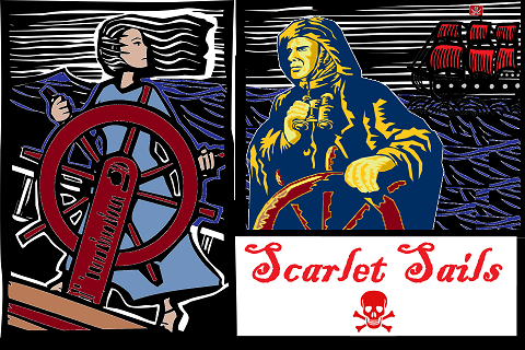
The post-comp SCARLET SAILS app is twice as long as the (finished, and rather well-received) original, and it branches wildly from the first choice.
As soon as it’s released, it’ll be available on all the places you buy your apps. It’s fun, magical, sexy, and has plenty of rum and violence (often at the same time). In the post-comp version, you can choose what you wear and see the world differently depending on your chosen magical style.
I’ve set up just for piratical fun (of which, believe me, there is plenty to be had). It’ll be busy for the next few months, then much stealthier (until such time as the next pirate book comes out).
This photo is famous, not because I look so uncannily like Captain Jack Sparrow, but because this was taken the day I met and fell in love with my husband.

“Scarlet Sails” covers, redux
I wrote about designing the cover for SCARLET SAILS (aka my interactive pirate book….probably coming out within two months, yay!) over here.
The cover has to come in several versions, with very specific dimensions. So here’s what I have now:


![]()
All of the above (which I now realise should have borders so you can actually see the dimensions, but whatever) are the descendants of this lovely lady (below, with watermark to protect the artist), from Shutterstock.
You can see the changes I made (eye colour, feather, etc) for yourself. The middle image above is far too short and wide to have the same word-and-image-and-nothing-else design, so I went with a slightly different concept.
I think the key to this cover design is its simplicity, so I’m avoiding the temptation to mess with it too much. We’ll see how that goes.
I’ll be VERY interested to see how this book sells in comparison to “Attack of the Clockwork Army”, and especially what ratings it gets. I think I’ve grown as a writer (the book is longer, the backstory far simpler, and the setting familiar) but we’ll see!
And of course, I really like my covers. I’ll know if I’ve screwed up if people rate it badly based on their impression of the cover. Her prettiness probably suggests more romance than the book has, but we’ll see (allowing polyamory in the book is a treat for people who’d like to romance more than one character, but/and it was a nightmare to code).

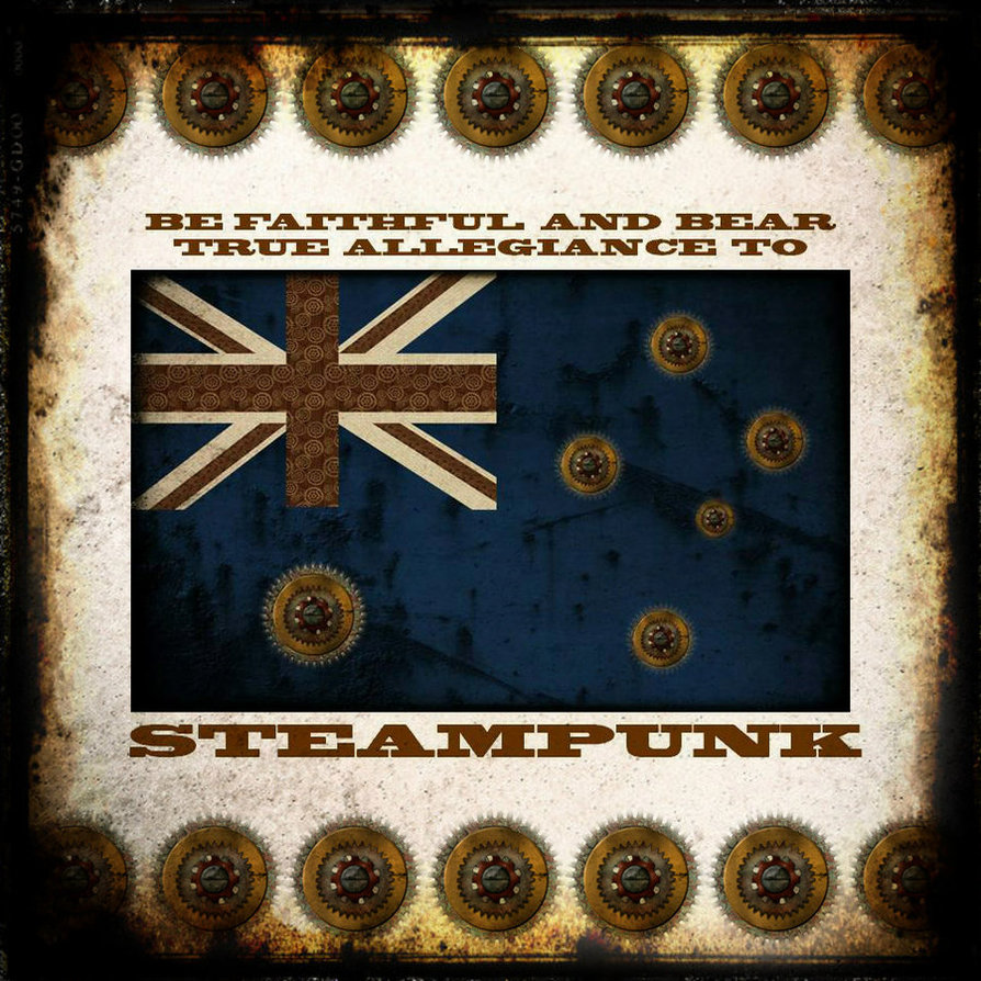
HEART OF BRASS novel to be published May 2016
Making a Cover
At the moment, I’m designing a cover for my interactive pirate fantasy adventure, Scarlet Sails – the same Scarlet Sails that placed 7th in the Interactive Fiction Comp 2015, and has since been edited so much that it’s now twice as long (mainly due to greater branching – you can actually play almost the same game if you like, except it’s better written now). One of the conditions of the competition is that the game must be available for free, so although the game was as good as I could make it at the time, I’m highly motivated to make the post-comp version significantly bigger and better. Having a different cover (and a significantly higher word count with various completely new chapters) sends a clear message that it’s worth paying a few dollars for a whole lot of extra content.
The original cover was made by using a public-domain skull and crossbones and adding a red background:

It was always perfectly obvious how the cover was created, and that no artist was involved, but it also communicated the basic points of the story rather well: pirates, clichés, and violence. It worked well in any size, too.
This is the current version of the new cover (it comes in various dimensions depending on the device):

In fact, since posting those images I made the woman darker and got rid of the distant flag altogether:

The woman is darker because sixteen years ago, when I first conceived this world, it was in part a reaction against the white man-dominated fantasy worlds I’d grown up with (and that I still love), and I was living in Indonesia – a land of 13,000 tropical islands, and roughly as many different cultures – at the time.
So, dark skin was important. Part of the reason the image originally appealed is because it was black and white, so she could theoretically be any skin tone. I tried a darker tone originally but was afraid it obscured her features so I overcompensated in the other direction. Today I tried a bit darker, and I think it works. She may get darker in later drafts; we’ll see.
These are the three main images the picture is built from (I took several hours finding them on shutterstock, and discarding many others for various reasons – obviously the ones I used were paid for and therefore had the watermarks taken off legally):
By three different artists 🙂
The cover image journey also involved these ladies (who are a tad too sexy and/or Freudian, and implausibly dressed and built, but nonetheless portray piracy and fun and non-realistic adventure violence rather well):
And then I kept looking, and I found these:
Even sassier and more fantastic.
The same problems kept cropping up over and over again: Artists who drew men didn’t tend to draw women (and vice versa). There were only a few dark-skinned pirates (either in photographs or artwork) – although to be fair, I was only about 100 pages through 500 shutterstock pages of images (the skin-tone colour is what led me to the wood-cutting style of illustration). And often when a picture captured the attitude of the book perfectly it fell down in another area eg the cover I’ve worked on above works well proportionally, has both a man and a woman (in the story, you can pick your gender) in a similar style, and has a sense of nautical adventure – but the actual pirate symbol has to be tacked on. And there’s not much sense of fun.
I really love the red-head with the eyepatch and I suspect I’ll change either her hair colour or the text to imply darker skin*, and use her as a splashscreen image (it displays briefly just before the game begins). Or possibly start over, and make her the entire cover image.
I’d certainly still consider using the women with the cutlass over her shoulder as a cover, especially if I could darken her skin and/or add a dress-up scene into the story (in the world of interactive fiction, anyone who saw a cover like that would expect it!)
*It’s possible for dark-skinned people to have red hair, but rare (especially for that wavy style). It’s more likely to be done with magic, in which case it would be referenced in the text.
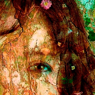
My top secret project
A little while ago, I signed a non-disclosure agreement.
I’m not good at keeping secrets.
I sure hope I don’t get in trouble for this entry.
It’s just… I’m very excited about this…thing… that I’ve just finished. It has a vampire or two, and a forest with a mind of its own, and shapeshifters, and love, and death, and Queen songs (if you know where to look), and it’s going to drive people crazy and they’re going to love it.
Here’s a suitably mysterious photo that has literally nothing to do with what I’m talking about.
When I can say more, I will.
Believe me.

Starship Adventures
The square picture is for icons, the wide ones with the title are…er…title screens. The pointy ones just show up for a second as the app opens.
Or something like that.
Party Post-Mortem
At a typical book launch, this is what happens:
Someone does an intro; the author talks a bit and reads a bit; people buy the book; the author signs it; people mingle and eventually depart. There’s food and usually wine. A lot of launches happen at conferences, where new fans are everywhere… but mostly those potential fans ignore the launch and walk on past.
I hate book launches.
At a typical book launch, this is what happens (redux):
A desperate author silently screams for the fame and fortune that will never come. They dance like a chained monkey at the whim of social expectations and a necessary gamble.
An apathetic audience squirms inside, watching the slow death of dreams and wondering if the brie is still fit for human consumption (and if so, then for how much longer?) The cut-price chardonnay slowly warms to room temperature as the red wine and last hopes of artistic survival attempt to breathe.
Everyone (who knows what’s good for ’em) buys a book and the author signs them. There is an awkward pause, and then everyone goes home.
The above is not at all true of course; but that’s the experience as seen through a social anxiety disorder (combined with chronic illness and the associated financial problems laid on top of the pre-existing artist poverty). So, although book launches are legitimately fun, I just can’t handle them. There are only three possible social occasions more awful: a doomed wedding; a musical performance by someone I know (regardless of their talent level); a poetry reading.
One of the peculiarities of my anxiety disorder is that I’d rather BE the desperate author than watch them. I feel more in control; I am certain that whatever I feel is entirely delusion-free (even if I thought something quite different five minutes earlier); and adrenaline works with me instead of fighting against me.
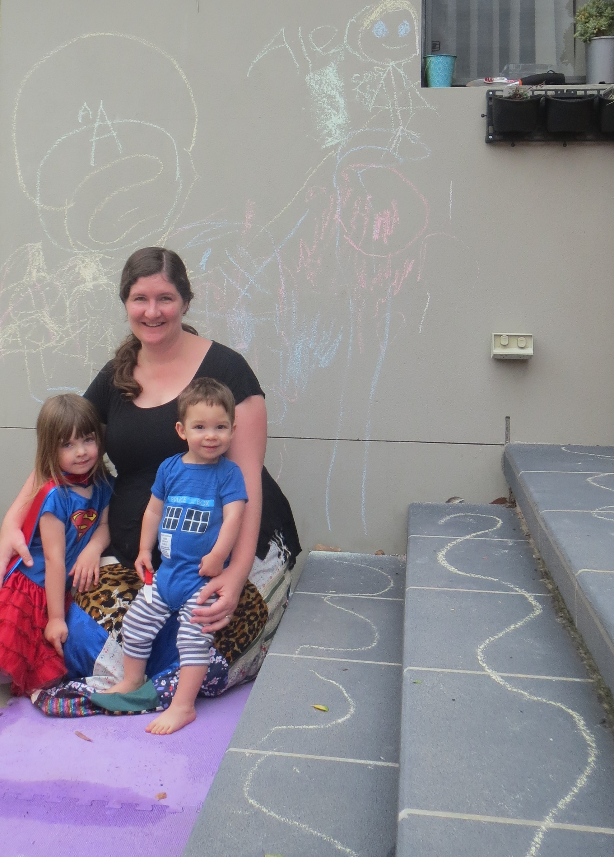
In any case, with “Attack of the Clockwork Army” I decided to do things my way. So I had an epic book launch party that ran from 10 in the morning until 9 at night (that’s eleven hours) so people could drop in and drop out whenever. I hosted it at my own home, and welcomed both small children and strangers (an interesting combination). There was a room just for duplo, and a designated reading room.

In this picture there are phones (including one toy phone), ipads, and a kindle. It’s not even the reading room, and that was fine by me! (I did spent some time in the reading room with two people showing them the mechanics of ChoiceScript. They and I enjoyed it thoroughly.)
I prepared various foods in advance, and cooked several low-maintenance things during the party – a chocolate fountain, sausage rolls, a terducken roast (duck and turkey and chicken), pre-mixed cookies.
And, to my amazement, people actually came. Here’s some interesting (to me) stats on the attendees:
People related to me (not counting people that live here): 10

People from Canberra Speculative Fiction Guild (and their families): 11
Assorted friends and their families from various schools (including Louisette’s school): 9
Miscellaneous: 12 (including an ex, two complete strangers, one of Louisette and TJ’s babysitters, an ex-workmate, a role-player, a ballroom dancer, and someone I met at a party one time).
Total number of people in the house throughout the day: 46.3. And a cat. There was a moment after lunch when there was no-one there for about twenty minutes, and then the arvo crowd flowed in. Other than that, it always felt like a lot of people – but never so many that it was unpleasantly crowded (although in the morning there were 8 kids at once, which is a LOT – having a bucket of chalk outside was absolutely perfect.)
-People who’d never been to my house before (from the above lists): 16 (one of whom I hadn’t seen for over ten years)
-In costume: 8


-Kids: Twelve; all but one aged 5 or less.


I didn’t do any official reading of the book at all (but encouraged people to read the book for themselves – it’s very easy to find on any app store; you just search for “Attack of the Clockwork Army” and it comes up with gratifying readiness).
But. My writerly friend (pictured here showing off his “Cat in the Hat” tattoo while playing with play-dough) decided to do a live reading of the romance scene. He was reading it for the first time, and he happened to have chosen the character of a lesbian woman.
That was an unforgettable experience.
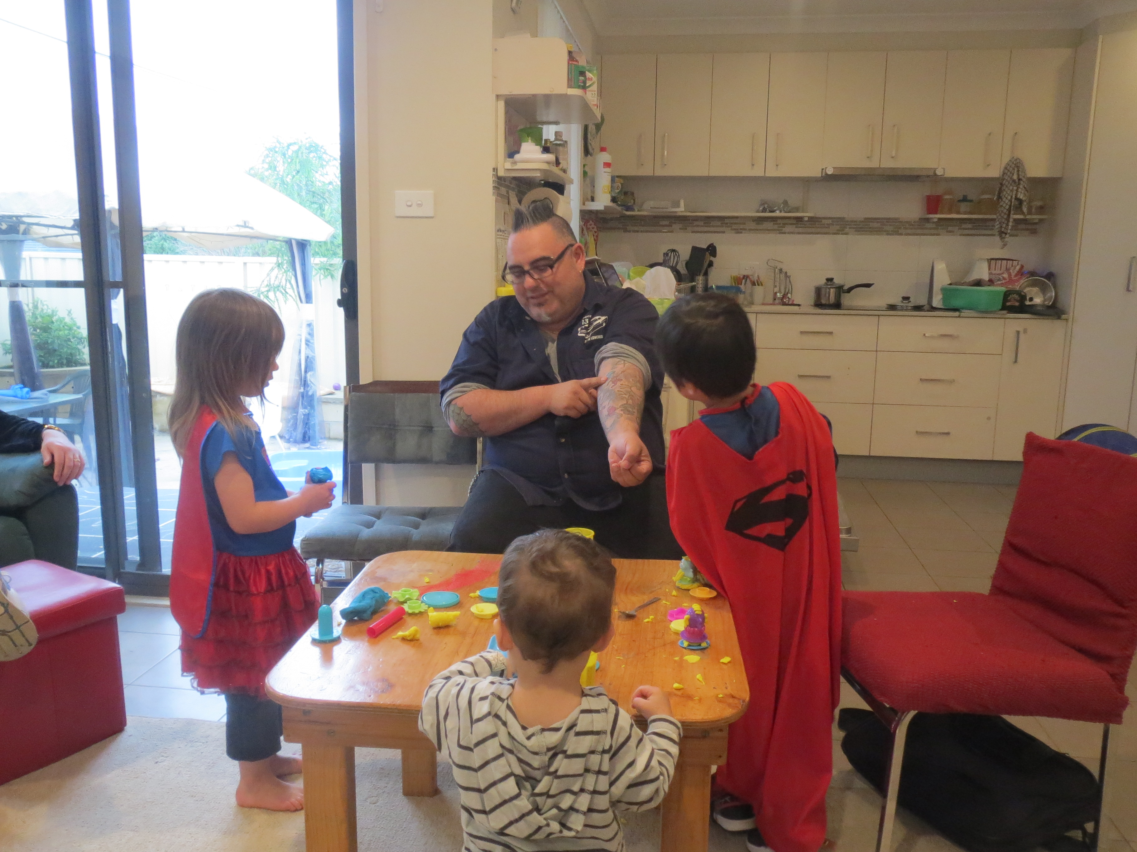
Not long after this photo was taken, Superman and Supergirl were having adventures outside when Superman decided it was That Kind Of Party and promptly got naked, immediately followed by Supergirl. Superman’s mum and I nearly died laughing.
As evening closed in, new clothes were applied and the party calmed down. TJ decided it was the perfect time to perform the famous “why-are-you-people-still-here-the-party’s-over” manoeuvre. He fetched his sister’s toy vacuum cleaner and got to work.

He and Louisette had a marvellous day; I discovered the sheer culinary glory of double brie dipped in a chocolate fountain (DO try this at home, if you possible can); people discussed interactive fiction, famously awful parties I’ve hosted in the past (the one with the fake guests was only the second-worst); steampunk, gaming, when plates were invented, and data collection laws; my historical food expert friend discovered terducken (and white chocolate raspberry sorbet); a few people left reviews of the book in various places; and I had fun.
Pretty sure that means it was a success.
Every book launch should have a chocolate fountain, a lesbian man with a Dr Seuss tattoo, and a pair of buck-naked superheroes.
