IF Comp 2021: Review of “The Library”

For the second time, I found a game that…
- described itself as choice-based but was parser at its heart (in my opinion).
- I was unable to finish due to technical issues.
I love a magical library, and this one is great. I wouldn’t describe it as a “nightmare”. I mean, sure, you’re asleep—and you might commit a murder if the situation calls for it—but it was definitely funny and playful rather than scary or horrifying.
Unfortunately, the language isn’t flawless. This is probably another person writing in their second (or third, or very possibly fifth or more—being multilingual is SO COOL you guys) language. It’s ALMOST right most of the time (and I noticed that the first few adventures are slightly more polished than later chapters), and it’s usually easy to tell what the writer means and what is going on.
So it’s a significant flaw, but all it needs is a couple of intense drafts (probably by paid English speakers) to fix.
As I keep saying, I am allergic to parser. It makes me cry. And this game is parser trying very hard to feel natural. It doesn’t always succeed, but a big part of me appreciates the attempt—having buttons to choose instead of needing to type directions made things a lot easier for me.
But still, it’s parser, and my brain does NOT like that. I’m all about the story, not the puzzles. So I quickly headed over to the walkthrough, which worked really well for ALMOST the whole game. I hit a game-breaking bug quite early on, and restarted—but when I hit another one very close to the end I wasn’t willing to risk it happening a third time. Plus I felt I had a pretty good grasp on the game.
Game breaking bugs get a fail mark, and frequent language errors get another two points off. So at this point it scores 3.
But.
The central concept—taking items from one famous book to fix problems in another—is utterly brilliant, totally hilarious, and charmingly done. I can see the writer put a lot of thought into how the game works and what goes where. It made me wish I’d thought of the idea. I really enjoyed it.
So I’m giving it a 6, just like “Recon”. Two games that showed genuinely amazing potential but failed in both language and execution. This writer is definitely one to watch in years to come.
IF Comp 2021: Review of “Recon”
I’ve been given some paid editing work, which is a bit too similar to reviewing games for my liking (sitting in a chair reading on my laptop and keeping my editor-brain engaged) BUT I’m still going to try to review five games.
I sorted the games into Choice-based games under 1 hour (parser makes me cry, and I know I can’t concentrate for more than an hour anytime soon). That gave me 12 games. I dropped “Fine Felines” on account of being the author; dropped “we, the remainder” thanks to the content warning (THANK YOU for not letting me wander into something traumatic); dropped “The Waiting Room” for being horror (I am a DELICATE FLOWER people!); dropped “extraordinary_fandoms.exe” for abusive stuff; “Weird Grief” for being about grief; “The Last Night of Alexisgrad” for being two-player; “Mermaids of Ganymede” for body horror, and “Walking Into It” for being puzzle-y.
That leaves “Universal Hologram” (6), “An Aside About Everything” (4), “The Golden Heist”(6), “Recon” (2), and “The Library” (3).
Five games, assuming I’m able to make them all work (which is highly unlikely; I’m remarkably bad at technical stuff). The numbers in brackets above indicate how many reviews each game has received and therefore the order in which I’ll attempt them.
I’m not looking at names, because (a) I’m extremely forgetful, so I might well not recognise the user name of someone I consider a friend, and that would be awkward, and (b) Less bias 🙂
So… RECON.
This is an intensely confusing game. The language is sufficiently mistake-filled that I sometimes can’t tell what the writer is trying to say. But an even worse thing, for me, is that the game is filled with puzzles. It’s not the writer’s fault that I hate puzzles with a fiery passion (to their credit, the writer provided a walkthrough—which I did use), but there should have been an indication of the game’s puzzly nature in the blurb.
So I’m inclined to give the game a failing mark of 3 stars (out of 10)… except it’s not the writer’s fault that I hate puzzles so much. So then I’d give it a 5. But despite the extremely flawed English, it’s clear that the writer is actually very very good. It’s an interesting and fully-realised setting, and there are lots of glimmers of brilliance here and there (in my first play-through I thought the black colour of the hyperlink on a certain page was an error and in the second I realised there was a plot reason to hide the button—neat). So in the end I’ll give it 6 for a brilliant but broken game. Hopefully the writer will keep improving their English because they’re a valuable addition to the IF world.

Am I a “Bad Art Friend”?
A bit, yeah. But no.
This is a tale of two female writers, written about in detail (with twists) by the New York Times, here.
I’ll tell this story in chronological order rather than the unfolding story of the article.
Writer #1: Dawn Dorland. Sunny, generous, and extra. White. Not a super successful writer.
Writer #2: Sonya Larson. Hard worker/community member. Asian heritage. Successful writer.
Dorland and Larson were in the same writers’ group and attended many of the same events for more than eight years. Dorland thought Larson was a good friend of hers.
Dawn donated a kidney to a stranger, just because she could. She made a private FaceBook group of friends and family, including Larson, to talk about it. She also shared the letter she wrote to the recipient of her kidney, saying why she felt motivated to donate to a stranger (mostly, because her very poor childhood made her extra empathetic, and so she loved that stranger and thought about them and their life with great joy and care). She also posted about her “kidneyversary” a year later. And she became a public face of live organ donation.
Early on, shortly after her surgery, she thought it was strange that not everyone in her private FaceBook group had commented positively about her choice to donate a kidney. She messaged Larson specifically, “confirming” that Larson was aware of what she’d done. Larson wrote back saying that Dorland had given a tremendous gift.
Meanwhile, several members of the writing circles Dorland was in were mocking her obvious need for affirmation about her kidney donation, sending hundreds of emails back and forth sharing how uncomfortable they felt and how Dorland came across as so needy.
And yeah, kids. I can understand starting a private FaceBook group to talk about a scary surgery and a tough recovery (possibly even coordinating meal delivery or something like that), but hinting at an individual person for more praise is clearly a bit weird. (Unless it’s with immediate family or VERY close friends, and acknowledging what you’re doing.)
Dorland is clearly someone who desperately needs affirmation. And that’s awkward and annoying but…. fundamentally harmless. If I needed a kidney and had to tell someone she was the greatest, kindest person ever every day for the rest of my life in order to get that kidney, it would be super annoying but worth it.
People aren’t just one thing. Dorland is generous and empathetic towards strangers, but she’s also super needy. Both of those things are true.
Clearly, a lot of people found Dorland annoying, including Larson, and I’m sure had found her annoying for years without her knowing. I’ve been in writer groups. There are always plenty of weirdos. I’m one kind of weirdo, and I’m aware that not everyone will like my company. If you put twenty of my acquaintances in front of me, I could probably say which ones feel neutral/negative about me. But I’d get some wrong, too.
So far, this is awkward but not newsworthy (I mean, it’s worth writing news stories about Dorland’s donation, but not about the dynamics of her writing group). And having a bunch of people mocking you for hundreds of pages behind your back probably means it’s not a group filled with kindness. On the other hand, they didn’t think up a pretext to chuck her out, so they could have been worse.
But.
Larson, who specialises in characters who are painfully lacking in self-awareness, wrote a story called “Kindness”. It’s about an Asian American woman with a drinking problem who is in a car accident and needs a kidney donation. Her friends hope that the near-death experience will motivate her to get over alcohol and be a better person. A white American woman donates a kidney, and also writes a letter about her motivation. But as the story unfolds it becomes clear that the white woman has a bad case of White Savior syndrome, and wants to have power over the Asian American woman. The Asian American woman defiantly refuses to change anything about who she is. And that’s the story.
And yeah, it was very very obviously based on Dawn. In the first draft, her name was used and her letter was used, verbatim. (In one of the emails, Larson said she was trying to change the text of the letter, but it was just “too perfect”. She did change it, but it was still very recogniseable.)
Larson didn’t tell Dorland anything about the story. Dorland discovered its existence because of a mutual friend, who was aware the story was about a donated kidney and that Dorland had donated a kidney.
Dorland was furious, and became more so as more details came to light. Specifically, her letter was still recogniseable. And yet Larson had barely acknowledged her kidney donation in real life.
When she spoke to Larson about it, Larson said that the whole idea of kidney donation was inspired by Dorland’s generosity, but that was all. That was a lie she stuck to for a long time (until the emails came to light). Much gaslighting occurred.
Dorland took legal action, which is still ongoing (and complicated eg a writer’s letters ARE protected by copyright, but satire is legal). And complex.
At one stage, Larson pointed out that the story is FICTION. It is art. All friends of writers know that some details from them and their life may end up in fiction, but it doesn’t mean anything and the writer doesn’t owe their friends anything. Larson said Dorland is a “bad art friend”.
Dorland continues to attack Larson through legal channels, feeling violated at having her words and her life made public without her consent.
Larson and others (no one seems to be saying anything in Dorland’s defence) are extremely uncomfortable about how Dorland is turning Larson’s story into “that story about kidney donation” when it’s actually not about kidney donation at all. It’s about White Saviour stuff. The white lady in the story isn’t even the main character. More than one person has said that Dorland seems to be more interested in tearing another person down than actually writing her own stuff (to be fair, suing people is way more profitable than trying to make it as a writer).
And there’s a whole extra layer of racism, as a white woman claims that her words are what makes the story special…. when actually, it’s the Asian American woman’s story that makes the white woman’s words special (and the words in the letter have gone through several drafts, too, and are now quite different).
So yeah, Dorland is absolutely a “bad art friend”. She’s also clueless (about who is actually friends with her, and about her own motivations), vindictive/sensitive (to keep fighting this), and has a childish need to be praised.
And Larson was never her friend.
I have writer friends (and non-writer friends), and it’s complicated. I once wrote a novel that was literally about a single party that I went to (with flashes back and forward in time). It was obviously based on a particular friendship group, including a person who self-harmed after manic episodes and a trans woman. If you knew this group at all, you’d obviously recognise precisely who those characters were based on. I did change the names, but appearances, relationships, and much more were the same. So I approached several people and explained what I’d done, offering to have them read all the sections in which they were mentioned (and/or the whole book) and let me know if I needed to change things. That wasn’t easy, but it was definitely necessary. There are obvious ethics at play there, and possibly legal stuff (although the worst stuff I did was say one person was overweight, and have some people have crushes on people that were either secret or nonexistent… and would be old news by the time the book was published).
I often hesitate to read books by people I know, in case I hate the book and it’s awkward. But to be honest, it’s happened plenty of times and although I’ve sometimes told people what I didn’t like about their books (because I thought they could take it, or because I’d promised to tell them what I thought) I usually just stay quiet. And I never, ever ask someone I know what they thought about MY books, either. If they write a public review, though, I read it—and often edit the book based on things they say that are negative. (Bad reviews don’t bother me, unless they mention a legitimate flaw in the book—and I don’t blame the reviewer for that.)
So, that’s a social complication in writer-town. The other one is the successful/not divide. Basically, I try not to give advice to any writer about writing because they’re probably better than me. The exception is when I’m teaching a class or running a panel, or if someone asks a question (most often, “Did you say you get PAID for interactive fiction? Tell me more.”) I also try to be super polite and respectful to everyone at writer cons (unless they’re someone I think I know well, in which case I relax without being insulting). I have a terrible memory so I could easily be talking to an acquisitions editor, internationally best-selling author, or publisher. The whole world of writing and publishing is extremely insular anyway, so I would never be horrid to anyone because you can get blacklisted for that. (Speaking of which, I bet Dorland either gets published now, while she’s infamous, or absolutely never. I certainly wouldn’t want to be near her.) I have had a couple of one-on-one conversations about other writers who have insulted people, but that wasn’t to laugh at them; it was to comfort their victims.
We writers do sometimes size each other up by either genre* or level of publishing success (in this order: not published, self-published, short stories published, published by a small press, successfully self-published, published by a large press, Holy Crap I’ve Heard Of You).
Genre: I tend to lose interest if they write literary fiction or nonfiction, to admire them but not read them if they write horror, romance, or realist/thriller fiction, and to light up if they write fantasy.
So there’s lots of social complexity to navigate. Larson was a bit douchy, but it’s a good enough story that it was worth losing the friendship of someone she never actually liked.
Dorland has issues. She is indeed a bad art friend, but since Larson was never actually her friend I’d be sympathetic if Dorland hadn’t kept pushing and pushing, making things difficult for Larson.
I relate more to Dorland in this story. I’m hyper empathetic, which I consider both a deep part of me and something that is part of my suite of mental illness. I’ve thought about randomly donating a kidney myself in the past, but quickly realised my health isn’t up to it. So I run a free food pantry (which I can’t really afford, oops) and a refugee sponsorship group (which is often hard work). Those two things are necessary for me to feel “okay” about… well, existing. In my privileged white person space.
That’s where Dorland and I diverge. She is cheerfully tearing down an Asian woman over a minor slight (I know Dorland is very upset and feels violated about it all, but she’s being very precious about a minor thing), and seems amazingly unaware of her own mixed-up motivations for donating a kidney.
Unlike her, I KNOW I have a White Saviour complex. (Go ahead and satirise me in your fiction all you like—just please change my name.) I know that a big part of my charitable activity is purely to feel like a “good person” and another part is to feel “in control”, particularly during a pandemic.
I largely accept these mixed-up motivations in myself, because I think the end result is worth it. I also *love* weighing in on moral discussions like this, which presumably is also motivated by my self-image as a “good person”. And a reasonably self-aware person. Probably the most dangerous part of my own White Saviour complex is that I often have power over people (eg the refugees I meet may depend on me for important cultural or legal knowledge—the goal of sponsorship is to increase their power and knowledge until they don’t need help any more).
So yeah, I’m a White Saviour type. But I try not to be an asshole about it.
IF Comp 2021: Cover Image Reviews Part 2
Part 1 is here. This is the second and final part.
Keep in mind that blurbs are displayed RIGHT NEXT to cover images, and I’m deliberately ignoring them.
Onwards!

Mermaids of Ganymede
Space mermaids? Uh, YES PLEASE. The cover image isn’t complex or super polished, and it absolutely does not have to be. Sometimes a concept, expressed in the simplest possible terms, is just a winner. The title and cover are both simple and perfect.

The Miller’s Garden
Looks and sounds like a simple medieval-ish setting. The picture is beautiful and peaceful, and I bet the story is too.
As a novelist, I’m always looking for conflict. Who needs a punch? Who’s about to die for love? Who is a nice hateable villain and how do we kill them dead? One of the interesting differences between “normal” novels and interactive novels is that some interactive novels simply don’t need conflict. At all. Some don’t even need goals. The subject of the title—”Garden”—suggest this might be one of those games. Something that is a meandering experience rather than a dramatic tale.
Sounds excellent.

My Gender Is a Fish
Be still my bisexual heart.
This looks like an “experiential” game, possibly designed to help the poor limited straights know a bit of what life is like for LGBTIQA+ folk (are those trans colours? I hope so). Crossed with absurdist humour (everyone knows fish are funny). Very excellent, if so.
The cover uses symbols well, and verges on iconic for that reason. But it doesn’t technically look good. Maybe the overall balance is off, or something. But it’s super readable and memorable, which are the two most important things in a cover. (And it meshes perfectly with the title.)

Off-Season at the Dream Factory
That title is so intriguing—twice over. “Dream Factory” is already an interesting juxtaposition of concepts that immediately makes me wonder what the factory is like. Then “Off-Season” adds even more spice. And humour.
The image is nice and bucolic. The kind of setting that a lot of dreams are made of. But it’s a slightly wasted opportunity, because dreams could be super bonkers. Is there magic? Are there robots? Romance? Nightmares? All of the above?
It’s a lot easier to write about interesting worlds than to illustrate them all, so I suspect the writer simply chose not to waste time/money on the cover when they could do something that was adequate enough. Which this is. It’s the title that packs a real punch, and it’s extremely likely I’ll give this game a go.

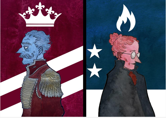
A Papal Summons, or The Church Cat
Hmm. Two very different titles mashed into one (and I notw with disapproval the iffy choice to have lower-case on the cover for title #2 but upper-case for the actual title version of the two titles).
The only thing both titles have in common is that they both sound medievalish, and have a link to church/the Church.
“A Papal Summons” sounds ominous, possibly involving complicated and heartless church politics and power struggles. Great setting, but one I don’t personally like. “The Church Cat” sounds like a sweet, small-scale, possibly kid-oriented tale. Which of course appeals to me.
But the cover screams: power, politics, and possibly murder. (Is the author’s name really “Bitter”? That is cool and highly appropriate.) I prefer lots of cheerful and bloody murder to politicking. Murder is natural, politics is depraved. (Apologies to all the politicians out there slogging through the swamp to try to make the world better.)
Hate politics, love cats. But the cover leans more to the ‘political’, so I’ll give this one a miss unless the blurb is something very different.
A Paradox Between Worlds
I beta tested this, but I shall empty my brain of all knowledge before proceeding.
Major points off for having a different title in the image to the actual title.
Once again, we have a cover that screams “scifi” and “clever” while also using pink (which to me signals that there will be some diversity, which the genre badly needs). It’s obviously set in space, probably travelling in a spaceship of some kind (but not a cartoonish spaceship, a serious intellectual space ship). The characters are secondary to the plot.
(I happen to know that almost everything I just said is wildly incorrect. But I’m sure the blurb makes that clear.)

Plane Walker
Hmm. Plane schematics. Looks puzzly, and possibly quite hard. I’m out.
Also, it looks pretty awesome and interesting, probably with cool engineering-type challenges that teach you about the innards of planes. Which I suspect will be popular.

Recon
Another puzzly one I think. The cover looks kind of awesome, but also kind of crowded. I like the contrast of light and dark. And I’m very glad there’s a face in there, because otherwise it would be dull. It looks like it might be influenced by anime like the original Ghost in the Shell. Thematically it could be something about humanity being crushed inside a highly technological society? Or inside an army, since “Recon” sounds like a military term?
Not sure what it is, but I’m pretty sure it’s not for me just because I’m not into puzzles, hard scifi, or military stuff.

RetroCON 2021
The janky picture has ‘retro’ written all over it, both literally and figuratively. Flawless match of title and image style, and the fonts are beautifully awkward too.
So, humour and nostalgia. I suspect it’ll be packed with affectionate references to IF from years and decades past—which means it’s not for me, because I haven’t been around that long and I’d miss loads of jokes and feel dumb as a result.
As noted in Part 1, putting the year in the title dates a game almost instantly. But in this case, why not?
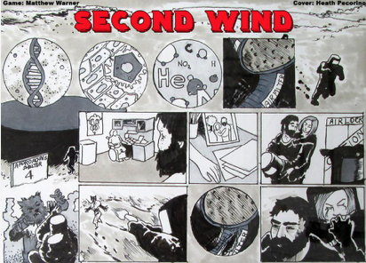
Second Wind
Super crowded image, but on the up side it gives me a bunch of clues about the game. Scifi, puzzly, with a fierce alien to fight and a lady to rescue and/or mind after her injury and/or make cry.
There’s a lot of art there, which makes me think the story might be illustrated.

Silicon and Cells: Machina Ex Deus
It’s… okay, I suppose. The “ili” in “Silicon” is tricky to read, and the words feel off-balance in the image. But the font and the starry background say “scifi”… and yet again we have an intellectual/space-ish scifi that has pink in it. That’s three.
I don’t think the author spent a bunch of time on it, so good for them (since covers are not part of the judging process).
The subtitle, flipping deus ex machina, is by far the most interesting part, and the most likely thing to make me want to read it.

Smart Theory
Looks like some kind of corporate espionage setting, involving people stealing a theory from their competition? (Or more likely, the people with the theory defending it from another company trying to steal it.)
It’s a nice ominous image that rewards you for looking deeper. But it’s impossible to read the text in most settings.
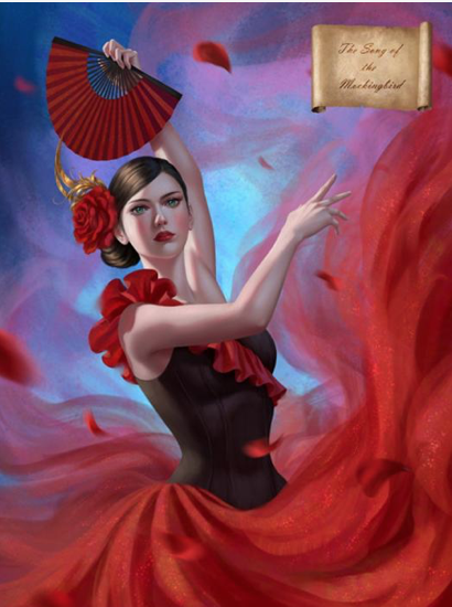
The Song of the Mockingbird
Pretty lady!
Like many others, I’m a sucker for a pretty lady. It’s a simply gorgeous image, and her facial expression is immediately interesting (fierce? or tragic?).
The scroll in the upper corner is nice, but the title on it is barely legible due to size and font choice.
Based on picture alone, I’m assuming the dancer is the mockingbird. Mockingbirds have great literary implications (“To Kill A Mockingbird” and “Mockingjay” immediately come to mind). But there’s a strong implication of tragedy, which makes her facial expression definitely fall on the “tragic” side.
Is the lady pretty enough to overcome my aversion to anything emotionally heavy? Probably not.

The Spirit Within Us
Creepy and thoughtful. The ye olde lettering with spidery outliers is excellent, and fits the blurred picture nicely. It suggests something introspective, something scary, and possibly something philosophical or spiritual… three things that put me off, but will draw others in. The visual composition is perfect, making the reader slightly off balance and as they try to figure out what the image is. Which is perfect for this story (if it’s what I think it is).

Starbreakers
This image gives me almost no information. It’s a… filing cabinet? With mostly blank labels, but pastels instead of black or beige. Files would suggest a police case, but pastels suggest a uni student enjoying their stationary (possibly to put off doing real work). But the title suggests space wars.
So, I have no idea what’s going on. The pastel colours look nice together, but that’s about all I can say about this image. When you haven’t figured out yet that it’s files, it looks like kids’ candy cigarettes.
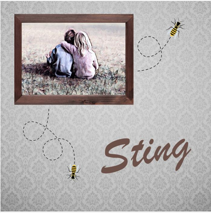
Sting
Childhood best friends in a photo frame (a boy and girl facing away from camera—perfect for self-insertion so long as the reader is white). Old-fashioned wallpaper. Bees.
The bees look kind of sweet, especially with the dotted lines. If not for that, I’d suspect the childhood best friends were torn apart when one of them had a fatal reaction to a bee sting.
Instead, I think that it will be a bittersweet and nostalgic tale of a happy childhood (the bitter part being that childhood is gone).

Taste of Fingers
Horror.
This image is immediately compelling and scary. The font is perfect (it’s weird how many fonts look amateurish); the frame and rain and handprint are all perfect.
The title strongly implies cannibalism. The rain implies… depression? The darkness of the human soul and/or condition?
This isn’t for me, but I bet it’s extremely well-written. This image screams “professionalism”.
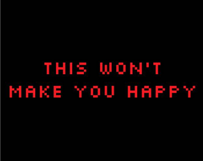
This Won’t Make You Happy
This cover is yelling at me to go away, which I will absolutely do. It will definitely attract a bunch of people, though. It’s simple and iconic and the pixelated text harks back to the Zork era—which, again, is repulsive to me and attractive to many. It also suggests that it’s parser based.
So this cover that cost nothing and took about thirty seconds to make works just fine. Partly because of the killer title.

The TURING Test
No cover. Tsk, tsk, tsk.
But how would a computer design a cover? They don’t know how to do art. They can’t understand the inexplicable social associations of colour choices, fonts, and images. So it kind of works to have to cover for this one.

Unfortunate
The title immediately suggests something sad or bad. That and the planetary imagery immediately makes me think of The Fault in our Stars. So… teens dying of cancer? Not my bag, but a lot of people like something deep (and possibly thoughtful).
The cover is quite visually appealing, although the font is a little hard to read (while at the same time being unique and adding to the artsy/bittersweet/tragic teen vibe).

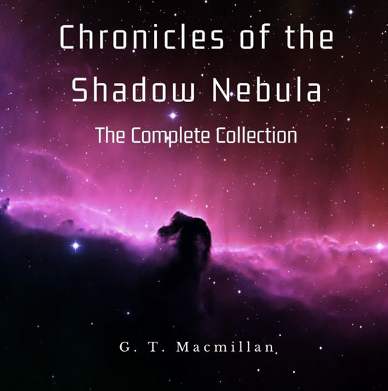
Universal Hologram
Is that a FOURTH pink-tinged scifi tale? I’m not 100% sure it’s scifi, but the title sure sounds like it, and that… sculpture?… looks a little like DNA.
I’m gonna say… arty scifi? Cool combo if so.

The Vaults
Yesssss! A creepy underground chamber holding mysterious treasures? Sounds grand. Vaults are immediately interesting, because you already have a mystery (What’s in it?) and a problem (How do we get in?)
As a setting, it lends itself to a puzzly game. Especially since it’s plural (vaultS).
The image is kind of cool, but a little hard to make out. I don’t like the modern-style “VAULTS” logo on the bottom left, which breaks the sense of ancient mystery from the main picture.

Wabewalker
I’m super confused by everything here. What on earth is a wabewalker? The lines above the title suggest something to do with puppets, either literally or metaphorically (serial killer puppetmaster genius?)
The TV screen suggests retro.
The golden thing in the middle looks like maybe a coffin or sarcophagus?
The people in robes look like they might have masks on?
Is it all subtle hints to in-game puzzles? Puzzle types might like it, if so. I sure don’t.
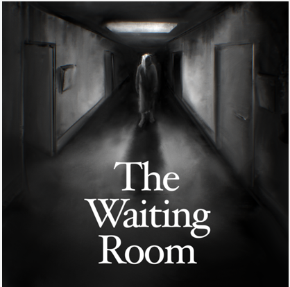
The Waiting Room
Creepy and excellent. Too scary for me, definitely. Black and white and blurry is excellent. Font is good. Composition is nice, and the vanishing point style adds to the creep factor. I bed there’s body horror, because hospitals are deeply scary and how could you resist? (I mean, if you’re not me.)
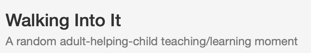
Walking Into It
No cover, no problem!
The title tells us almost nothing (it implies a social faux pas). The subtitle gives us plenty of information, but the “adult-helping-child” and the “/” gives it a clumsy feeling that makes me think it might have more clumsy phrasing inside. (I join words with dashes a BUNCH, but not in a subtitle. Subtitles should be crisp.)

we, the remainder
This image is really really hard to see. I like a little bit of mystery, but not that much. It’s a hooded angel with a sword. The courier font harks back to old-school parser games. It is, I grudgingly admit, a little bit cool. But definitely not my scene (which probably means it’s weeded out those who would hate the game, as a good cover should).

Weird Grief: Mourning is hard. A story of grief, sex, and escapism.
By now y’all know that the simple word “grief” will have me running for the hills. The face in the question mark is super cool. Other than that, there’s nothing much in the image. Nor does it need much.
I like the title though, which immediately says “good writing” because grief IS weird, so the writer has either been through grief themself, or is a good enough writer to know that emotions are messy. The “grief, sex, and escapism” also says “good writing”…. but the “Mourning is hard.” part of the subtitle is super obvious and should have been cut.
The “ei” and “ie” in “Weird Grief” have a cool mirror-like effect.
Normally, a question mark would mean it’s a mystery of some sort, which I don’t think is true here. I’m not sure what a question mark has to do with grief.
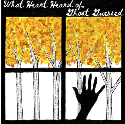
What Heart Heard of, Ghost Guessed
I hate the title with a fiery passion. It’s either poetic or badly written. I’m guessing poetic. And yup, there’s another thing I hate. Ew, poetry. The font also strongly implies poetry, as does the image of a hand against a windowpane in autumn.
Yeah, I’m getting “poetry” loud and clear from the title, image, and font. So, many points for consistency. That should help it find the right audience (aka not me).
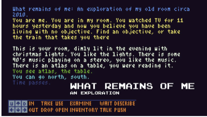
What remains of me: An exploration of my old home in search for an objective in life, the way I observe the world, with thoughtfulness and humour.
Another poetic title, that also sounds like it’s reflective and/or sad.
At the same time, it’s another very old-school-game-looking image, which sends me running but will attract many.
That subtitle is a LOT. It’s way too long, and it also tells the reader that it’s thoughtful and humourous, instead of letting them discover the thoughtfulness and humour for themself.
It sounds very personal, too. Whether that’s good or bad depends very much on the reader.

You are SpamZapper 3.1
That sounds GREAT. “SpamZapper” is such a fun word, and it also tells us that the story is about stopping spam. The hands all pointing inward look cool, although I dislike the janky look of the central puzzle piece.
I’m guessing this is a fun puzzler.
Wow! That’s all seventy-one entries. Even such an arbritrary and deliberately under-informed look at this list of games makes it immediately obvious that this is going to be a great year with everything from humour to kids’ stories to horror and poetry.
I love the IF Comp.
IF Comp 2021: Cover Image Reviews Part 1
The Interactive Fiction Comp is a huge deal in the interactive fiction community, and it’s been a big part of my life ever since I became a writer of IF myself (in 2015). This year, I entered a story called “Fine Felines” which is all about breeding cats, and also features a player character who has fibromyalgia (like me) and several autistic characters (I am probably autistic, but the road to diagnosis is long).
Entering the comp is a super emotional experience, made both better and worse by the reviews. The wait for one’s first review can be torturous, so every year I intend to write a bunch of reviews for people but often don’t get far (because, life). So this year, vibrating with excitement and mania and love for all, I’ve decided to take a page out of someone else’s book (I want to say Sam Kobo Ashwell?) and review all the cover images. In alphabetical order, and in the highly non-scientific fashion of “Does it make me want to read it?”
PLEASE NOTE: the covers literally don’t matter. We don’t judge the covers, like, at all, as part of the comp itself. So don’t panic if I’m super harsh about your cover. I am also carefully NOT reading the blurbs or even noting whether a game is parser (which I am allergic to) or choice-based. Since the blurbs are displayed RIGHT next to the cover images, this entire blog entry is based on being deliberately obtuse.
So please don’t take these reviews at all seriously, whether you’re a writer or a reader.

4 x 4 Archipelago
You know what? I love it! This immediately appeals to my sailpunk heart. It has so many cool elements: the old-timey look (like a treasure map), the sea monsters, islands, pirate imagery, mountains, sea, palm trees (I love the tropics), and a volcano. I don’t like ghosts, but other than that every single detail is utterly alluring. The subtle colours draw me in because they’re so different to the usual attempts at drawing attention (black! red! etc!)

AardVark Versus the Hype
Okay, first of all the title is 100% hilarious, because every so often an IF Comp reviewer will go through the games in alphabetical order and I already know (from the author chats in the forum) that the author chose the word “Aardvark” for precisely that reason.
And still ended up in second place.
Such is life in the IF Comp. There’s always something weird going on.
This slightly cheap-looking cover says, “Funny” to me. Which is both appealling and repulsive to me, because (a) I like games that are light, and humour games are unlikely to be emotionally traumatising. (b) What if it’s actually not funny at all? That would be painful.
The capitalised ‘v’ in AardVark’ disturbs me on a deep level, and I don’t know why. Clearly, it’s a choice. It may be linked to something significant in the story. Or it may just be a bit of extra fun. But it’s making me tetchy. Possibly my proofreader side refusing to allow innovation, I dunno.

After-Words
This is a great cover. To me it says, “Scifi” and “clever” and at the same time “not excessively white-male-ish, even though it’s scifi”. Yes, the cover really is that specific. Because scifi often suffers from straight white male authors talking to straight white male readers about how clever they all are. And yeah, clever is cool. But that type of thing often suffers from all the characters being cut-out characters (because emotions are for the weak, presumably), so they can be super boring.
But THIS cover has a purple element, even pink. To me, that says that the characters are better developed than in the bad scifi described above. And it’s clever without being dull. Because straight white men are terrified of the colour pink. Everyone knows that.
I even kind of like “After-Words”, despite my proofreader self. I feel like there’s something clever there, possibly a meditation on what the dead leave behind or something like that. Which puts me off, because if “After” is about death or the afterlife or something I don’t want to read it. It’s a theme that always makes me depressed, no matter how light the story. But obviously that’s just me.

And Then You Come to a House Not Unlike the Previous One
This is a great cover image. It has texture, and feels lived in. That makes me expect the story and characters will feel real. Being a pile of floppy disks, I suspect it’ll be set in the 80s. That makes me suspect two bad things: 1. The writer doesn’t feel comfortable with the ubiquity of mobile phones, and how many problems they instantly solve, so they’ve set the story in the familiar setting of their own teens/twenties. 2. Nostalgia fest.
I really like the super-long title, bucking the modern trend towards brevity. Although it’d be tricky to display in an app store setting.

An Aside about Everything
My proofreader is screaming about yet another clearly deliberate choice (in this case, the lack of capitalisation for “an”—interestingly, in the image but not in the actual title). And it definitely looks better in the image that way.
I’m conflicted.
The black and white with the falling colour-inverted silhouette is extremely powerful. It makes me feel slightly off-balance myself, and I don’t understand the connection between the image and the title. The image feels so dynamic and physical, and the title feels philosophical (yuck!) so I’m once again conflicted.

At King Arthur’s Christmas Feast
Cool. Definitely a medieval adventure. The headless guy is Sir Gawain (aka the Green Knight) I think, and I’m cautiously interested in seeing how they choose to tell the famous story. Stories about honour intrigue me. I wonder if I’ll be choosing whether to face or avoid the Green Knight in this story.
Hah. I’m already regretting the choice to review 71 cover images. 71 is a LOT less than last year, which had over 100 entries (great news for those who entered this year, and have a much better chance of doing well)… but it’s still a lot.

The Belinsky Conundrum
It’s probably either scifi, thriller, or something about spies. The image is compelling…. but I hate it. Among other mental issues, the human body grosses me out. So seeing a close up of an eye, even though it’s not life size, squicks me out. And “Belinsky” suggests there are Russians involves, so possibly cold war era spy stuff. Which can be fun.
Really potent image.

Beneath Fenwick
I actually beta tested this one, so I know it quite well (I used the walkthrough supplied by the author), but I’ll try to forget what I know. The old-looking bricks suggest a lower-income urban environment, and “Fenwick” sounds like it’s in the UK. The font (and the word “Beneath”) suggests horror, or at least edging in that direction. So this story is not for me—horror is too scary, and an underprivileged urban environment doesn’t sounds like a fun place to spend my time. Although it gets some points for (probably) being set in the UK. It might even have UK/Australian spelling, which I like when I can get it.

The Best Man
Brilliant. The image has a bit of a Bond vibe, not in a spy or a womanising way, but in the sense of being competency porn. I like that. The black and white, slight blurriness, and the lines across the image make it super creepy. The title is immediately interesting, because “Best Man” is such a weird term. As every four-year-old has asked at least once, “If he’s the best man then why is she marrying the other guy?”
One assumes there is a wedding (always a setting for drama) and that there will be betrayal and twists galore. Sex scenes are likely, so personally I’d check the content warnings before diving in. Murder is a possibility too.

BLK MTN
Woah. That is a bold choice of title. I feel like the image should have a big looming mountain in it (rather than a low ridge), and that the skull in the clouds should be a little whiter, so it looks less like an addition and more like an actual cloud.
But the skull is still pretty subtle and cool. And a warning that this is probably too scary for me.
I also wonder if there’s a story reason for the abbreviations in the title. Don’t get me wrong; they’re cool on their own (and a little interactive, as the mind immediately translates them). I’m just curious. Maybe even curious enough to read it.

No cover image! Bad bear!
Someone (wisely or otherwise) chose not to bother doing a cover that is worth absolutely nothing to the contest.
The title is good. I’m a sucker for alliteration, although in this case it makes me think it’s a kids’ story. Which is probably about the level of emotional risk I can stand, so I’ll most likely play it.

Closure: an ill-advised sad teen heist
Hmm. The word “Closure” and the setting (obviously with lots of emails/SMSes, which makes me think teens/twenties characters interacting online in some fashion) makes me think there will be a big relationship breakup. Sounds super un-fun. But then the “i did something totally cool and normal that you will definitely not disapprove of” in the cover image sounds very fun indeed. So I’m cautiously interested. But I think my desire to NOT experience sex and/or relationship drama (however vicariously) will be enough to keep me away from it. While attracting plenty of others.
The subtitle pulls me in with “heist” and pushes me away with “sad”.

Codex Sadistica: A Heavy Metal Minigame
Sounds awesome, and definitely not for me. The cover shreds (is that the correct term?) although I think the blood spatter looks a bit pink (or, perhaps, the pink lines look a bit like blood spatter). Font is perfect, and a lack of image makes sense for something music-based.

The Corsham Witch Trial
It took me a long while to see that this cover is a computer screen and desk—a modern (or modern-ish; the computer is a bit old) setting, rather than a medieval one. So, minus points for not being a clear image (the byline is hard to read too).
I give it a few points for surprising me by having a modern-day (ish) witch trial. But I feel like there are two ways for a witch trial story to play out: either the witches are innocent women, or they turn the tables and kill the inquisitors. The cover isn’t original enough to convince me that it will be different.

Cyborg Arena
The title is plenty on its own: Cyborgs? In an Arena? Who needs more info right now?
Love the neon, love the subtle steampunk vibe. Admittedly, I probably won’t actually read it but I bet plenty of people absolutely will. I hope the cyborgs are customisable.

Cygnet Committee
I’m so confused by this. From the title, I thought it was something to do with swan babies. But the hidden person in the cover image, and the logo look of the central image make me think it’s a businessperson kind of thing.
Nice logo, but I’m not sure if I want to read something set in the corporate world.

D’ARKUN
Looks like an awesome horror story. Too scary for me, but a bet lots of people will love it.
I don’t know what the title means (something set in France?) or why it’s capitalised. My angry proofreader hates the capitals. She’s so judgemental, amirite?
Although the font choice is excellent (I love the glow), and the image itself has glorious texture.

No cover image (and apparently no children).
Post-apocalyptic crime sounds cool. Although there’s something a little clumsy about the phrasing of the subtitle, possibly because it’s conveying two things (kids aren’t getting born + a murder mystery) in one sentence.

The Dead Account: When does “just doing your job” cross a line?
This is just so, so, confusing. It actually makes me think that the wrong image was put with the story, because the cover clearly says “Hivekind”. The cover looks like something lighthearted, possibly for kids. The title (and particularly the subtitle) makes me think about Nazis and war crimes.
In conclusion: huh?
EDIT:
I’m not a fan of Nazis, and having self-proclaimed Nazis alive today spreading hate is an unbearable tragedy that is too awful for anyone to joke about (including me; I didn’t intend the comment above as a joke).
The subtitle “When does “just doing your job” cross a line?” reminded me of the defence of many Nazis in post-war trials that they were “just following orders”, and the fact that “following orders” most definitely does not make crimes against humanity okay (or crimes of any kind, for that matter).
This does NOT actually have anything to do with the story.
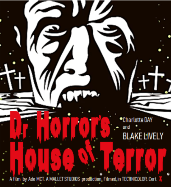
Dr Horror’s House of Terror
Perfect cover for fun, self-aware horror, probably with vampires. It reminds me of Steph Cherrywell’s “Brain Snatchers” story. Love the face, love the black and white and red. The font is perfect, of course.
Not my scene, but a lot of people will love it.

Enveloping Darkness
It’s rather…uh… dark. I don’t love it, but it works okay. More scary stuff that I won’t read. I admire horror from a distance, but there are plenty of smart and awesome horror fans who are sure to give this a go.
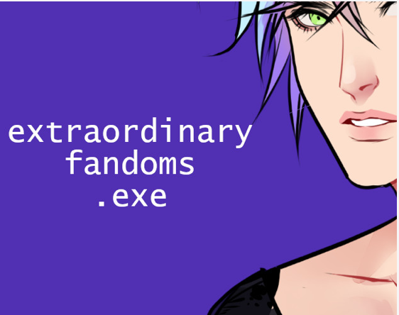
extraordinary_fandoms.exe
My angry inner proofreader is already spewing—which is good, because this is a story about online fandoms, and that is a land my inner proofreader can’t deal with. (I’m nearly 40, for those currently guessing my age.)
It’s a really interesting setting, and the cover is both arresting (a face is almost always a good bet) and indicative of the distinct flavour of this story. Probably.
(I beta tested a different game set in the fandom space. Did NOT expect there to be two of them, which shows how entirely unhip I am.)

Finding Light
Looks like another kids’ story. Great. Medievalish setting, possibly talking animals, possibly animal protagonist. The way the wolf is facing away, into the image, is a classic technique for getting readers to self-insert into the story. It works well here.
The almost black and white image is an unusual choice for such a light-hearted story, but it helps the title stand out. The font is slightly babyish, which adds to the “for kids” vibe.

Fine Felines: Have you ever wished you could breed cats for a living?
Now THIS is a cover. Look at those adorable little kitties! With the tongue! And the simple colours make it stand out. I bet this is the greatest and best story ever written, and that the simple act of reading it will make me more attractive, happier, and a better person.
Having said that…
The author clearly wanted the shove her name in there, even though it looks messy against the fur. And the left-hand kitten is slightly out of frame, which is just wrong. Not sure about the font choice, either. Although it’s cool that the orange colour shows through the middle of the letters.
Looks like a kids’ story, possibly animal protagonist.
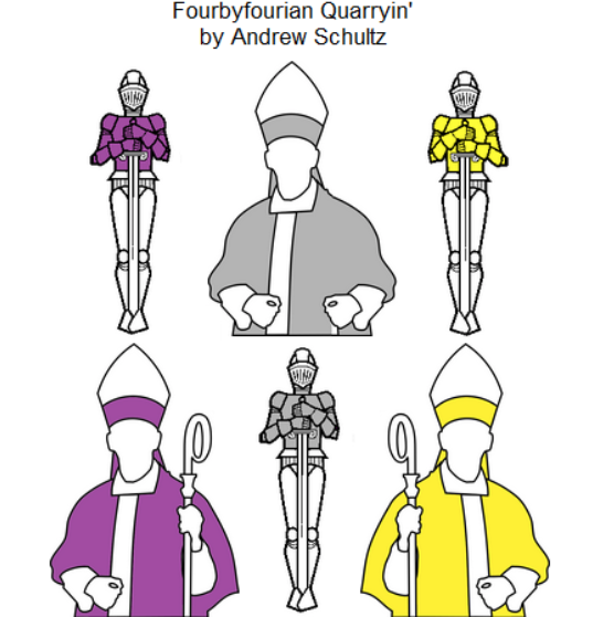
Fourbyfourian Quarryin’
I hate this title with a fiery passion. The cover suggests something medieval, but puzzly (it’s making me think of chess for some reason). Definitely not my scene, although I bet it’s good. Way, way too smart for my liking.
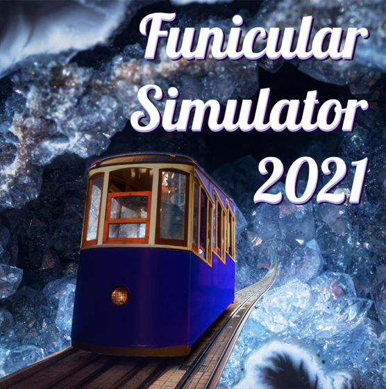
Funicular Simulator 2021
I don’t know what “funicular” means. Is it a tram-like thing? The cover gives me a “magic school bus except fantasy instead of scifi” vibe, which is very appealling. The title and the main focus of the image are perfectly balanced. The crystals appear organic at first, and then reveal themselves as crystals with a second look. That’s cool.
Putting the year into the title is a very strange choice, because it will immediately date it, and make it seem old exactly three months from now.
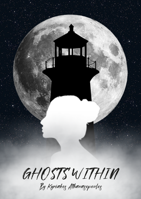
Ghosts Within
This is another cover image that uses black and white to good effect. The three symbols: lighthouse, female silhouette, and full moon all suggest loneliness and/or mystery. I bet it’s an atmospheric tale with a female-locked protagonist.
The font works, except the author name is very hard to read.

Goat Game: A Hollow-Horned Rumination
Goats are funny. Rumination is hard brain work. I don’t know what this story is about so I’m not going to speculate.
This cover looks great. It’s distinct and a little artsy, and the font and layout is perfect. Although I really don’t know anything about the game itself.

The Golden Heist
Heist is good, and Golden Heist is better. The cover image strongly suggests something either historical or archaeological. Both are good combined with the idea of a heist.
It’s a little dull as an image, but it works to suggest an interesting setting.

Grandma Bethlinda’s Remarkable Egg
Pretty sure I’ve encountered Grandma Bethlinda before, and loved her. This is a great title, and a great cover image that is so simple it becomes iconic. I don’t really know much about the story, although “remarkable egg” combined with the fact it’s a kids’ story says “fantasy”. Yeah, I’ll definitely read this one. I love fantasy, and I love a gentle story. (Unless it’s not a fantasy story, just a thing imagined by the characters that teaches the kids a moral lesson. I hate that kind of thing.)

Hercules!
Definitely a kids’ story, probably a mythic adventure. It looks a little bit too boy-oriented for me based on the cover. But it depends how many non-horror non-parser games there are for me to play.

The House on Highfield Lane
I’m guessing either a horror story or a murder mystery, set in the claustrophobic atmosphere of the titular house. Possibly historical, but more likely set in a historical house in the modern day.
Angry Proofreader Lady notes that “on” is capitalised in the cover but not in the title. Ugh.
“Highfield Lane” suggests both British and upper-crust. That can be fun.

How it was then and how it is now
The title tells me almost nothing, but the image screams “puzzler” with a strong hint of “maths”. Maybe the title suggests time travel? Not my scene, but probably a very good parser game.
Minus points for the byline being too small to read comfortably.

How the monsters appeared in the Wasteland
I helped beta test this, but I’ll pretend I didn’t.
“Monsters” and “wasteland” say post-apocalyptic loud and clear, and so does the image. I like the limited colour palette, and it suits everything (including, it must be said, the story itself). There’s even a tiny hint of “Mad Max” (which actually is quite suitable, having read the story).

I Contain Multitudes
I don’t know what the connection is between the image and the text, and I don’t know why it’s all slightly pixelated. The image of a steamer suggests something historical, but the pixelation and colours are from a very different era. “I Contain Multitudes” has a far more philosophical tone, which of course puts me off because I don’t like using my brain when I don’t have to (at least, not for thinking).
Confusion puts me off. Probably the blurb is crystal clear.

Infinite Adventure
This cover makes me recoil in horror. It’s very much old-school IF (specifically parser), which is absolutely not my bag. But I bet there are loads of people that melted into a nostalgic pile of goo the second they saw it.
(But saying “Adventure #2”, while also triggering the nostalgia feels for some, also implies the story might be a sequel. No one loves sequels.)

Kidney Kwest: Reinforcing lessons for children with kidney failure
The subtitle is almost uneccessary, because the cover image is such an excellent summary of what it’s all about. It’s an excellent picture that clearly conveys that it’s both (a) for kids, and (b) about kidneys/medical issues.
It looks like a custom picture, so kudos to the artist.
And yeah, under the circumstances, I’m okay with the spelling of “Kwest”.

No cover image for the doctor, so I’m flying blind. “Last” suggests post-apocalyptic, and doctor suggests possible medical scenes and/or body horror. That’d be a nope from me, but it’s a solid title.
The Last Night of Alexisgrad: A two-player piece of interactive fiction
The title and left-hand image immediately suggest coups in medieval Russia. Cool setting, with plenty of innate drama. And the cover also looks good, simply as a piece of art. I’m a sucker for pretty pictures.
The right-hand image suggests the possibility of mad science and/or magic.
I don’t know what the stripes or stars mean, or the red and blue, but they probably have a meaning within the story.
The author deserves credit for writing a two-hander (yay, innovation/uniqueness) even though the sheer organisational hurdle of getting two people coordinated will make it difficult to get many reviews.

The Libonotus Cup
Some kind of racing game I think. (Interestingly, this is about the fifth game to use skull imagery.) There is a confusing mishmash of symbols: racing flags (except I think they should be black and white checks?), pirate skulls, and I think the bunting-like flags at the top may have semaphore meanings. (All of which I say without looking anything up or having much general knowledge). Having said that, the central focus works, so the overall image looks good.
But I’m confused, which always makes me back off. Once again, I bet the blurb makes everything clear.

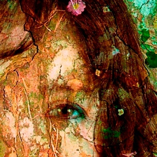
The Library: a textual nightmare
So I assume the setting is… a library. A library is a great setting. Magical library, haunted library, whatever. Libraries are awesome. The face of the central character is interesting too—to me it leans towards “mystery”. But “nightmare” suggests horror, so I’m out.
Okay! That’s forty of the seventy-one entries. I’m going to stop there and have a serious lie down*. I’ll do the rest pretty soon (well, probably).
*Who am I kidding? I’m going to scour the internets to try and find the first review of my story.