IF Comp 2021: Cover Image Reviews Part 2
Part 1 is here. This is the second and final part.
Keep in mind that blurbs are displayed RIGHT NEXT to cover images, and I’m deliberately ignoring them.
Onwards!

Mermaids of Ganymede
Space mermaids? Uh, YES PLEASE. The cover image isn’t complex or super polished, and it absolutely does not have to be. Sometimes a concept, expressed in the simplest possible terms, is just a winner. The title and cover are both simple and perfect.

The Miller’s Garden
Looks and sounds like a simple medieval-ish setting. The picture is beautiful and peaceful, and I bet the story is too.
As a novelist, I’m always looking for conflict. Who needs a punch? Who’s about to die for love? Who is a nice hateable villain and how do we kill them dead? One of the interesting differences between “normal” novels and interactive novels is that some interactive novels simply don’t need conflict. At all. Some don’t even need goals. The subject of the title—”Garden”—suggest this might be one of those games. Something that is a meandering experience rather than a dramatic tale.
Sounds excellent.

My Gender Is a Fish
Be still my bisexual heart.
This looks like an “experiential” game, possibly designed to help the poor limited straights know a bit of what life is like for LGBTIQA+ folk (are those trans colours? I hope so). Crossed with absurdist humour (everyone knows fish are funny). Very excellent, if so.
The cover uses symbols well, and verges on iconic for that reason. But it doesn’t technically look good. Maybe the overall balance is off, or something. But it’s super readable and memorable, which are the two most important things in a cover. (And it meshes perfectly with the title.)

Off-Season at the Dream Factory
That title is so intriguing—twice over. “Dream Factory” is already an interesting juxtaposition of concepts that immediately makes me wonder what the factory is like. Then “Off-Season” adds even more spice. And humour.
The image is nice and bucolic. The kind of setting that a lot of dreams are made of. But it’s a slightly wasted opportunity, because dreams could be super bonkers. Is there magic? Are there robots? Romance? Nightmares? All of the above?
It’s a lot easier to write about interesting worlds than to illustrate them all, so I suspect the writer simply chose not to waste time/money on the cover when they could do something that was adequate enough. Which this is. It’s the title that packs a real punch, and it’s extremely likely I’ll give this game a go.

A Papal Summons, or The Church Cat
Hmm. Two very different titles mashed into one (and I notw with disapproval the iffy choice to have lower-case on the cover for title #2 but upper-case for the actual title version of the two titles).
The only thing both titles have in common is that they both sound medievalish, and have a link to church/the Church.
“A Papal Summons” sounds ominous, possibly involving complicated and heartless church politics and power struggles. Great setting, but one I don’t personally like. “The Church Cat” sounds like a sweet, small-scale, possibly kid-oriented tale. Which of course appeals to me.
But the cover screams: power, politics, and possibly murder. (Is the author’s name really “Bitter”? That is cool and highly appropriate.) I prefer lots of cheerful and bloody murder to politicking. Murder is natural, politics is depraved. (Apologies to all the politicians out there slogging through the swamp to try to make the world better.)
Hate politics, love cats. But the cover leans more to the ‘political’, so I’ll give this one a miss unless the blurb is something very different.
A Paradox Between Worlds
I beta tested this, but I shall empty my brain of all knowledge before proceeding.
Major points off for having a different title in the image to the actual title.
Once again, we have a cover that screams “scifi” and “clever” while also using pink (which to me signals that there will be some diversity, which the genre badly needs). It’s obviously set in space, probably travelling in a spaceship of some kind (but not a cartoonish spaceship, a serious intellectual space ship). The characters are secondary to the plot.
(I happen to know that almost everything I just said is wildly incorrect. But I’m sure the blurb makes that clear.)

Plane Walker
Hmm. Plane schematics. Looks puzzly, and possibly quite hard. I’m out.
Also, it looks pretty awesome and interesting, probably with cool engineering-type challenges that teach you about the innards of planes. Which I suspect will be popular.

Recon
Another puzzly one I think. The cover looks kind of awesome, but also kind of crowded. I like the contrast of light and dark. And I’m very glad there’s a face in there, because otherwise it would be dull. It looks like it might be influenced by anime like the original Ghost in the Shell. Thematically it could be something about humanity being crushed inside a highly technological society? Or inside an army, since “Recon” sounds like a military term?
Not sure what it is, but I’m pretty sure it’s not for me just because I’m not into puzzles, hard scifi, or military stuff.

RetroCON 2021
The janky picture has ‘retro’ written all over it, both literally and figuratively. Flawless match of title and image style, and the fonts are beautifully awkward too.
So, humour and nostalgia. I suspect it’ll be packed with affectionate references to IF from years and decades past—which means it’s not for me, because I haven’t been around that long and I’d miss loads of jokes and feel dumb as a result.
As noted in Part 1, putting the year in the title dates a game almost instantly. But in this case, why not?
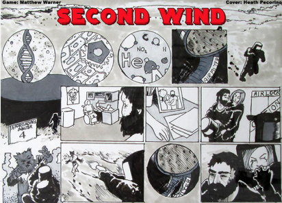
Second Wind
Super crowded image, but on the up side it gives me a bunch of clues about the game. Scifi, puzzly, with a fierce alien to fight and a lady to rescue and/or mind after her injury and/or make cry.
There’s a lot of art there, which makes me think the story might be illustrated.

Silicon and Cells: Machina Ex Deus
It’s… okay, I suppose. The “ili” in “Silicon” is tricky to read, and the words feel off-balance in the image. But the font and the starry background say “scifi”… and yet again we have an intellectual/space-ish scifi that has pink in it. That’s three.
I don’t think the author spent a bunch of time on it, so good for them (since covers are not part of the judging process).
The subtitle, flipping deus ex machina, is by far the most interesting part, and the most likely thing to make me want to read it.

Smart Theory
Looks like some kind of corporate espionage setting, involving people stealing a theory from their competition? (Or more likely, the people with the theory defending it from another company trying to steal it.)
It’s a nice ominous image that rewards you for looking deeper. But it’s impossible to read the text in most settings.
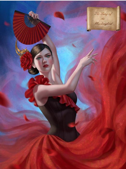
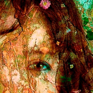
The Song of the Mockingbird
Pretty lady!
Like many others, I’m a sucker for a pretty lady. It’s a simply gorgeous image, and her facial expression is immediately interesting (fierce? or tragic?).
The scroll in the upper corner is nice, but the title on it is barely legible due to size and font choice.
Based on picture alone, I’m assuming the dancer is the mockingbird. Mockingbirds have great literary implications (“To Kill A Mockingbird” and “Mockingjay” immediately come to mind). But there’s a strong implication of tragedy, which makes her facial expression definitely fall on the “tragic” side.
Is the lady pretty enough to overcome my aversion to anything emotionally heavy? Probably not.

The Spirit Within Us
Creepy and thoughtful. The ye olde lettering with spidery outliers is excellent, and fits the blurred picture nicely. It suggests something introspective, something scary, and possibly something philosophical or spiritual… three things that put me off, but will draw others in. The visual composition is perfect, making the reader slightly off balance and as they try to figure out what the image is. Which is perfect for this story (if it’s what I think it is).

Starbreakers
This image gives me almost no information. It’s a… filing cabinet? With mostly blank labels, but pastels instead of black or beige. Files would suggest a police case, but pastels suggest a uni student enjoying their stationary (possibly to put off doing real work). But the title suggests space wars.
So, I have no idea what’s going on. The pastel colours look nice together, but that’s about all I can say about this image. When you haven’t figured out yet that it’s files, it looks like kids’ candy cigarettes.
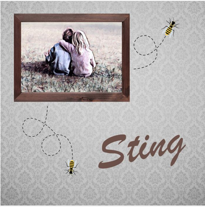
Sting
Childhood best friends in a photo frame (a boy and girl facing away from camera—perfect for self-insertion so long as the reader is white). Old-fashioned wallpaper. Bees.
The bees look kind of sweet, especially with the dotted lines. If not for that, I’d suspect the childhood best friends were torn apart when one of them had a fatal reaction to a bee sting.
Instead, I think that it will be a bittersweet and nostalgic tale of a happy childhood (the bitter part being that childhood is gone).

Taste of Fingers
Horror.
This image is immediately compelling and scary. The font is perfect (it’s weird how many fonts look amateurish); the frame and rain and handprint are all perfect.
The title strongly implies cannibalism. The rain implies… depression? The darkness of the human soul and/or condition?
This isn’t for me, but I bet it’s extremely well-written. This image screams “professionalism”.
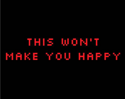
This Won’t Make You Happy
This cover is yelling at me to go away, which I will absolutely do. It will definitely attract a bunch of people, though. It’s simple and iconic and the pixelated text harks back to the Zork era—which, again, is repulsive to me and attractive to many. It also suggests that it’s parser based.
So this cover that cost nothing and took about thirty seconds to make works just fine. Partly because of the killer title.

The TURING Test
No cover. Tsk, tsk, tsk.
But how would a computer design a cover? They don’t know how to do art. They can’t understand the inexplicable social associations of colour choices, fonts, and images. So it kind of works to have to cover for this one.

Unfortunate
The title immediately suggests something sad or bad. That and the planetary imagery immediately makes me think of The Fault in our Stars. So… teens dying of cancer? Not my bag, but a lot of people like something deep (and possibly thoughtful).
The cover is quite visually appealing, although the font is a little hard to read (while at the same time being unique and adding to the artsy/bittersweet/tragic teen vibe).

Universal Hologram
Is that a FOURTH pink-tinged scifi tale? I’m not 100% sure it’s scifi, but the title sure sounds like it, and that… sculpture?… looks a little like DNA.
I’m gonna say… arty scifi? Cool combo if so.

The Vaults
Yesssss! A creepy underground chamber holding mysterious treasures? Sounds grand. Vaults are immediately interesting, because you already have a mystery (What’s in it?) and a problem (How do we get in?)
As a setting, it lends itself to a puzzly game. Especially since it’s plural (vaultS).
The image is kind of cool, but a little hard to make out. I don’t like the modern-style “VAULTS” logo on the bottom left, which breaks the sense of ancient mystery from the main picture.

Wabewalker
I’m super confused by everything here. What on earth is a wabewalker? The lines above the title suggest something to do with puppets, either literally or metaphorically (serial killer puppetmaster genius?)
The TV screen suggests retro.
The golden thing in the middle looks like maybe a coffin or sarcophagus?
The people in robes look like they might have masks on?
Is it all subtle hints to in-game puzzles? Puzzle types might like it, if so. I sure don’t.
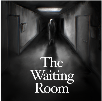
The Waiting Room
Creepy and excellent. Too scary for me, definitely. Black and white and blurry is excellent. Font is good. Composition is nice, and the vanishing point style adds to the creep factor. I bed there’s body horror, because hospitals are deeply scary and how could you resist? (I mean, if you’re not me.)
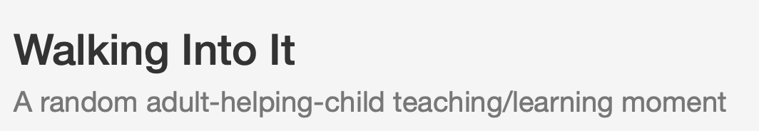
Walking Into It
No cover, no problem!
The title tells us almost nothing (it implies a social faux pas). The subtitle gives us plenty of information, but the “adult-helping-child” and the “/” gives it a clumsy feeling that makes me think it might have more clumsy phrasing inside. (I join words with dashes a BUNCH, but not in a subtitle. Subtitles should be crisp.)

we, the remainder
This image is really really hard to see. I like a little bit of mystery, but not that much. It’s a hooded angel with a sword. The courier font harks back to old-school parser games. It is, I grudgingly admit, a little bit cool. But definitely not my scene (which probably means it’s weeded out those who would hate the game, as a good cover should).

Weird Grief: Mourning is hard. A story of grief, sex, and escapism.
By now y’all know that the simple word “grief” will have me running for the hills. The face in the question mark is super cool. Other than that, there’s nothing much in the image. Nor does it need much.
I like the title though, which immediately says “good writing” because grief IS weird, so the writer has either been through grief themself, or is a good enough writer to know that emotions are messy. The “grief, sex, and escapism” also says “good writing”…. but the “Mourning is hard.” part of the subtitle is super obvious and should have been cut.
The “ei” and “ie” in “Weird Grief” have a cool mirror-like effect.
Normally, a question mark would mean it’s a mystery of some sort, which I don’t think is true here. I’m not sure what a question mark has to do with grief.
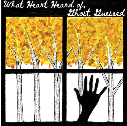
What Heart Heard of, Ghost Guessed
I hate the title with a fiery passion. It’s either poetic or badly written. I’m guessing poetic. And yup, there’s another thing I hate. Ew, poetry. The font also strongly implies poetry, as does the image of a hand against a windowpane in autumn.
Yeah, I’m getting “poetry” loud and clear from the title, image, and font. So, many points for consistency. That should help it find the right audience (aka not me).
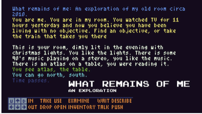
What remains of me: An exploration of my old home in search for an objective in life, the way I observe the world, with thoughtfulness and humour.
Another poetic title, that also sounds like it’s reflective and/or sad.
At the same time, it’s another very old-school-game-looking image, which sends me running but will attract many.
That subtitle is a LOT. It’s way too long, and it also tells the reader that it’s thoughtful and humourous, instead of letting them discover the thoughtfulness and humour for themself.
It sounds very personal, too. Whether that’s good or bad depends very much on the reader.

You are SpamZapper 3.1
That sounds GREAT. “SpamZapper” is such a fun word, and it also tells us that the story is about stopping spam. The hands all pointing inward look cool, although I dislike the janky look of the central puzzle piece.
I’m guessing this is a fun puzzler.
Wow! That’s all seventy-one entries. Even such an arbritrary and deliberately under-informed look at this list of games makes it immediately obvious that this is going to be a great year with everything from humour to kids’ stories to horror and poetry.
I love the IF Comp.

benoitsmithfr said,
October 4, 2021 at 6:47 am
To be honest, I care little about the covers, I just let myself stricken with awe before the liveliness of IF.
Best of luck for “Fine Felines”!