IF Comp 2021: Cover Image Reviews Part 1
The Interactive Fiction Comp is a huge deal in the interactive fiction community, and it’s been a big part of my life ever since I became a writer of IF myself (in 2015). This year, I entered a story called “Fine Felines” which is all about breeding cats, and also features a player character who has fibromyalgia (like me) and several autistic characters (I am probably autistic, but the road to diagnosis is long).
Entering the comp is a super emotional experience, made both better and worse by the reviews. The wait for one’s first review can be torturous, so every year I intend to write a bunch of reviews for people but often don’t get far (because, life). So this year, vibrating with excitement and mania and love for all, I’ve decided to take a page out of someone else’s book (I want to say Sam Kobo Ashwell?) and review all the cover images. In alphabetical order, and in the highly non-scientific fashion of “Does it make me want to read it?”
PLEASE NOTE: the covers literally don’t matter. We don’t judge the covers, like, at all, as part of the comp itself. So don’t panic if I’m super harsh about your cover. I am also carefully NOT reading the blurbs or even noting whether a game is parser (which I am allergic to) or choice-based. Since the blurbs are displayed RIGHT next to the cover images, this entire blog entry is based on being deliberately obtuse.
So please don’t take these reviews at all seriously, whether you’re a writer or a reader.

4 x 4 Archipelago
You know what? I love it! This immediately appeals to my sailpunk heart. It has so many cool elements: the old-timey look (like a treasure map), the sea monsters, islands, pirate imagery, mountains, sea, palm trees (I love the tropics), and a volcano. I don’t like ghosts, but other than that every single detail is utterly alluring. The subtle colours draw me in because they’re so different to the usual attempts at drawing attention (black! red! etc!)

AardVark Versus the Hype
Okay, first of all the title is 100% hilarious, because every so often an IF Comp reviewer will go through the games in alphabetical order and I already know (from the author chats in the forum) that the author chose the word “Aardvark” for precisely that reason.
And still ended up in second place.
Such is life in the IF Comp. There’s always something weird going on.
This slightly cheap-looking cover says, “Funny” to me. Which is both appealling and repulsive to me, because (a) I like games that are light, and humour games are unlikely to be emotionally traumatising. (b) What if it’s actually not funny at all? That would be painful.
The capitalised ‘v’ in AardVark’ disturbs me on a deep level, and I don’t know why. Clearly, it’s a choice. It may be linked to something significant in the story. Or it may just be a bit of extra fun. But it’s making me tetchy. Possibly my proofreader side refusing to allow innovation, I dunno.

After-Words
This is a great cover. To me it says, “Scifi” and “clever” and at the same time “not excessively white-male-ish, even though it’s scifi”. Yes, the cover really is that specific. Because scifi often suffers from straight white male authors talking to straight white male readers about how clever they all are. And yeah, clever is cool. But that type of thing often suffers from all the characters being cut-out characters (because emotions are for the weak, presumably), so they can be super boring.
But THIS cover has a purple element, even pink. To me, that says that the characters are better developed than in the bad scifi described above. And it’s clever without being dull. Because straight white men are terrified of the colour pink. Everyone knows that.
I even kind of like “After-Words”, despite my proofreader self. I feel like there’s something clever there, possibly a meditation on what the dead leave behind or something like that. Which puts me off, because if “After” is about death or the afterlife or something I don’t want to read it. It’s a theme that always makes me depressed, no matter how light the story. But obviously that’s just me.

And Then You Come to a House Not Unlike the Previous One
This is a great cover image. It has texture, and feels lived in. That makes me expect the story and characters will feel real. Being a pile of floppy disks, I suspect it’ll be set in the 80s. That makes me suspect two bad things: 1. The writer doesn’t feel comfortable with the ubiquity of mobile phones, and how many problems they instantly solve, so they’ve set the story in the familiar setting of their own teens/twenties. 2. Nostalgia fest.
I really like the super-long title, bucking the modern trend towards brevity. Although it’d be tricky to display in an app store setting.

An Aside about Everything
My proofreader is screaming about yet another clearly deliberate choice (in this case, the lack of capitalisation for “an”—interestingly, in the image but not in the actual title). And it definitely looks better in the image that way.
I’m conflicted.
The black and white with the falling colour-inverted silhouette is extremely powerful. It makes me feel slightly off-balance myself, and I don’t understand the connection between the image and the title. The image feels so dynamic and physical, and the title feels philosophical (yuck!) so I’m once again conflicted.

At King Arthur’s Christmas Feast
Cool. Definitely a medieval adventure. The headless guy is Sir Gawain (aka the Green Knight) I think, and I’m cautiously interested in seeing how they choose to tell the famous story. Stories about honour intrigue me. I wonder if I’ll be choosing whether to face or avoid the Green Knight in this story.
Hah. I’m already regretting the choice to review 71 cover images. 71 is a LOT less than last year, which had over 100 entries (great news for those who entered this year, and have a much better chance of doing well)… but it’s still a lot.

The Belinsky Conundrum
It’s probably either scifi, thriller, or something about spies. The image is compelling…. but I hate it. Among other mental issues, the human body grosses me out. So seeing a close up of an eye, even though it’s not life size, squicks me out. And “Belinsky” suggests there are Russians involves, so possibly cold war era spy stuff. Which can be fun.
Really potent image.

Beneath Fenwick
I actually beta tested this one, so I know it quite well (I used the walkthrough supplied by the author), but I’ll try to forget what I know. The old-looking bricks suggest a lower-income urban environment, and “Fenwick” sounds like it’s in the UK. The font (and the word “Beneath”) suggests horror, or at least edging in that direction. So this story is not for me—horror is too scary, and an underprivileged urban environment doesn’t sounds like a fun place to spend my time. Although it gets some points for (probably) being set in the UK. It might even have UK/Australian spelling, which I like when I can get it.

The Best Man
Brilliant. The image has a bit of a Bond vibe, not in a spy or a womanising way, but in the sense of being competency porn. I like that. The black and white, slight blurriness, and the lines across the image make it super creepy. The title is immediately interesting, because “Best Man” is such a weird term. As every four-year-old has asked at least once, “If he’s the best man then why is she marrying the other guy?”
One assumes there is a wedding (always a setting for drama) and that there will be betrayal and twists galore. Sex scenes are likely, so personally I’d check the content warnings before diving in. Murder is a possibility too.

BLK MTN
Woah. That is a bold choice of title. I feel like the image should have a big looming mountain in it (rather than a low ridge), and that the skull in the clouds should be a little whiter, so it looks less like an addition and more like an actual cloud.
But the skull is still pretty subtle and cool. And a warning that this is probably too scary for me.
I also wonder if there’s a story reason for the abbreviations in the title. Don’t get me wrong; they’re cool on their own (and a little interactive, as the mind immediately translates them). I’m just curious. Maybe even curious enough to read it.

No cover image! Bad bear!
Someone (wisely or otherwise) chose not to bother doing a cover that is worth absolutely nothing to the contest.
The title is good. I’m a sucker for alliteration, although in this case it makes me think it’s a kids’ story. Which is probably about the level of emotional risk I can stand, so I’ll most likely play it.

Closure: an ill-advised sad teen heist
Hmm. The word “Closure” and the setting (obviously with lots of emails/SMSes, which makes me think teens/twenties characters interacting online in some fashion) makes me think there will be a big relationship breakup. Sounds super un-fun. But then the “i did something totally cool and normal that you will definitely not disapprove of” in the cover image sounds very fun indeed. So I’m cautiously interested. But I think my desire to NOT experience sex and/or relationship drama (however vicariously) will be enough to keep me away from it. While attracting plenty of others.
The subtitle pulls me in with “heist” and pushes me away with “sad”.

Codex Sadistica: A Heavy Metal Minigame
Sounds awesome, and definitely not for me. The cover shreds (is that the correct term?) although I think the blood spatter looks a bit pink (or, perhaps, the pink lines look a bit like blood spatter). Font is perfect, and a lack of image makes sense for something music-based.

The Corsham Witch Trial
It took me a long while to see that this cover is a computer screen and desk—a modern (or modern-ish; the computer is a bit old) setting, rather than a medieval one. So, minus points for not being a clear image (the byline is hard to read too).
I give it a few points for surprising me by having a modern-day (ish) witch trial. But I feel like there are two ways for a witch trial story to play out: either the witches are innocent women, or they turn the tables and kill the inquisitors. The cover isn’t original enough to convince me that it will be different.

Cyborg Arena
The title is plenty on its own: Cyborgs? In an Arena? Who needs more info right now?
Love the neon, love the subtle steampunk vibe. Admittedly, I probably won’t actually read it but I bet plenty of people absolutely will. I hope the cyborgs are customisable.

Cygnet Committee
I’m so confused by this. From the title, I thought it was something to do with swan babies. But the hidden person in the cover image, and the logo look of the central image make me think it’s a businessperson kind of thing.
Nice logo, but I’m not sure if I want to read something set in the corporate world.

D’ARKUN
Looks like an awesome horror story. Too scary for me, but a bet lots of people will love it.
I don’t know what the title means (something set in France?) or why it’s capitalised. My angry proofreader hates the capitals. She’s so judgemental, amirite?
Although the font choice is excellent (I love the glow), and the image itself has glorious texture.

No cover image (and apparently no children).
Post-apocalyptic crime sounds cool. Although there’s something a little clumsy about the phrasing of the subtitle, possibly because it’s conveying two things (kids aren’t getting born + a murder mystery) in one sentence.

The Dead Account: When does “just doing your job” cross a line?
This is just so, so, confusing. It actually makes me think that the wrong image was put with the story, because the cover clearly says “Hivekind”. The cover looks like something lighthearted, possibly for kids. The title (and particularly the subtitle) makes me think about Nazis and war crimes.
In conclusion: huh?
EDIT:
I’m not a fan of Nazis, and having self-proclaimed Nazis alive today spreading hate is an unbearable tragedy that is too awful for anyone to joke about (including me; I didn’t intend the comment above as a joke).
The subtitle “When does “just doing your job” cross a line?” reminded me of the defence of many Nazis in post-war trials that they were “just following orders”, and the fact that “following orders” most definitely does not make crimes against humanity okay (or crimes of any kind, for that matter).
This does NOT actually have anything to do with the story.
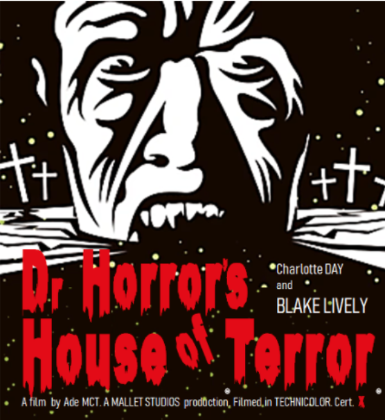
Dr Horror’s House of Terror
Perfect cover for fun, self-aware horror, probably with vampires. It reminds me of Steph Cherrywell’s “Brain Snatchers” story. Love the face, love the black and white and red. The font is perfect, of course.
Not my scene, but a lot of people will love it.

Enveloping Darkness
It’s rather…uh… dark. I don’t love it, but it works okay. More scary stuff that I won’t read. I admire horror from a distance, but there are plenty of smart and awesome horror fans who are sure to give this a go.
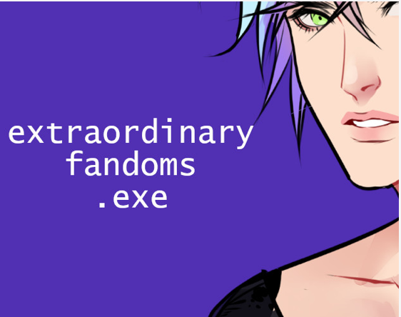
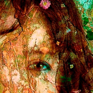
extraordinary_fandoms.exe
My angry inner proofreader is already spewing—which is good, because this is a story about online fandoms, and that is a land my inner proofreader can’t deal with. (I’m nearly 40, for those currently guessing my age.)
It’s a really interesting setting, and the cover is both arresting (a face is almost always a good bet) and indicative of the distinct flavour of this story. Probably.
(I beta tested a different game set in the fandom space. Did NOT expect there to be two of them, which shows how entirely unhip I am.)

Finding Light
Looks like another kids’ story. Great. Medievalish setting, possibly talking animals, possibly animal protagonist. The way the wolf is facing away, into the image, is a classic technique for getting readers to self-insert into the story. It works well here.
The almost black and white image is an unusual choice for such a light-hearted story, but it helps the title stand out. The font is slightly babyish, which adds to the “for kids” vibe.

Fine Felines: Have you ever wished you could breed cats for a living?
Now THIS is a cover. Look at those adorable little kitties! With the tongue! And the simple colours make it stand out. I bet this is the greatest and best story ever written, and that the simple act of reading it will make me more attractive, happier, and a better person.
Having said that…
The author clearly wanted the shove her name in there, even though it looks messy against the fur. And the left-hand kitten is slightly out of frame, which is just wrong. Not sure about the font choice, either. Although it’s cool that the orange colour shows through the middle of the letters.
Looks like a kids’ story, possibly animal protagonist.
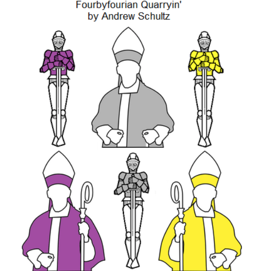
Fourbyfourian Quarryin’
I hate this title with a fiery passion. The cover suggests something medieval, but puzzly (it’s making me think of chess for some reason). Definitely not my scene, although I bet it’s good. Way, way too smart for my liking.
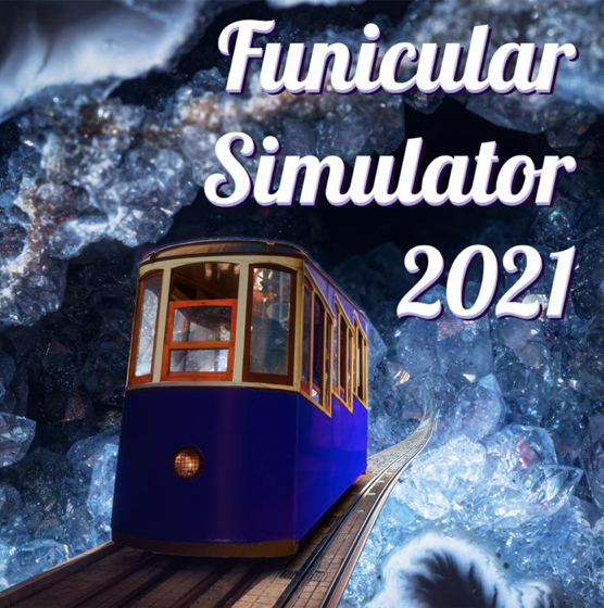
Funicular Simulator 2021
I don’t know what “funicular” means. Is it a tram-like thing? The cover gives me a “magic school bus except fantasy instead of scifi” vibe, which is very appealling. The title and the main focus of the image are perfectly balanced. The crystals appear organic at first, and then reveal themselves as crystals with a second look. That’s cool.
Putting the year into the title is a very strange choice, because it will immediately date it, and make it seem old exactly three months from now.
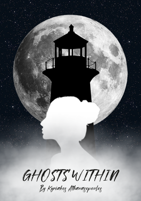
Ghosts Within
This is another cover image that uses black and white to good effect. The three symbols: lighthouse, female silhouette, and full moon all suggest loneliness and/or mystery. I bet it’s an atmospheric tale with a female-locked protagonist.
The font works, except the author name is very hard to read.

Goat Game: A Hollow-Horned Rumination
Goats are funny. Rumination is hard brain work. I don’t know what this story is about so I’m not going to speculate.
This cover looks great. It’s distinct and a little artsy, and the font and layout is perfect. Although I really don’t know anything about the game itself.

The Golden Heist
Heist is good, and Golden Heist is better. The cover image strongly suggests something either historical or archaeological. Both are good combined with the idea of a heist.
It’s a little dull as an image, but it works to suggest an interesting setting.

Grandma Bethlinda’s Remarkable Egg
Pretty sure I’ve encountered Grandma Bethlinda before, and loved her. This is a great title, and a great cover image that is so simple it becomes iconic. I don’t really know much about the story, although “remarkable egg” combined with the fact it’s a kids’ story says “fantasy”. Yeah, I’ll definitely read this one. I love fantasy, and I love a gentle story. (Unless it’s not a fantasy story, just a thing imagined by the characters that teaches the kids a moral lesson. I hate that kind of thing.)

Hercules!
Definitely a kids’ story, probably a mythic adventure. It looks a little bit too boy-oriented for me based on the cover. But it depends how many non-horror non-parser games there are for me to play.

The House on Highfield Lane
I’m guessing either a horror story or a murder mystery, set in the claustrophobic atmosphere of the titular house. Possibly historical, but more likely set in a historical house in the modern day.
Angry Proofreader Lady notes that “on” is capitalised in the cover but not in the title. Ugh.
“Highfield Lane” suggests both British and upper-crust. That can be fun.

How it was then and how it is now
The title tells me almost nothing, but the image screams “puzzler” with a strong hint of “maths”. Maybe the title suggests time travel? Not my scene, but probably a very good parser game.
Minus points for the byline being too small to read comfortably.

How the monsters appeared in the Wasteland
I helped beta test this, but I’ll pretend I didn’t.
“Monsters” and “wasteland” say post-apocalyptic loud and clear, and so does the image. I like the limited colour palette, and it suits everything (including, it must be said, the story itself). There’s even a tiny hint of “Mad Max” (which actually is quite suitable, having read the story).

I Contain Multitudes
I don’t know what the connection is between the image and the text, and I don’t know why it’s all slightly pixelated. The image of a steamer suggests something historical, but the pixelation and colours are from a very different era. “I Contain Multitudes” has a far more philosophical tone, which of course puts me off because I don’t like using my brain when I don’t have to (at least, not for thinking).
Confusion puts me off. Probably the blurb is crystal clear.

Infinite Adventure
This cover makes me recoil in horror. It’s very much old-school IF (specifically parser), which is absolutely not my bag. But I bet there are loads of people that melted into a nostalgic pile of goo the second they saw it.
(But saying “Adventure #2”, while also triggering the nostalgia feels for some, also implies the story might be a sequel. No one loves sequels.)

Kidney Kwest: Reinforcing lessons for children with kidney failure
The subtitle is almost uneccessary, because the cover image is such an excellent summary of what it’s all about. It’s an excellent picture that clearly conveys that it’s both (a) for kids, and (b) about kidneys/medical issues.
It looks like a custom picture, so kudos to the artist.
And yeah, under the circumstances, I’m okay with the spelling of “Kwest”.

No cover image for the doctor, so I’m flying blind. “Last” suggests post-apocalyptic, and doctor suggests possible medical scenes and/or body horror. That’d be a nope from me, but it’s a solid title.
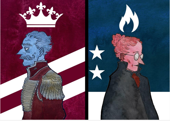
The Last Night of Alexisgrad: A two-player piece of interactive fiction
The title and left-hand image immediately suggest coups in medieval Russia. Cool setting, with plenty of innate drama. And the cover also looks good, simply as a piece of art. I’m a sucker for pretty pictures.
The right-hand image suggests the possibility of mad science and/or magic.
I don’t know what the stripes or stars mean, or the red and blue, but they probably have a meaning within the story.
The author deserves credit for writing a two-hander (yay, innovation/uniqueness) even though the sheer organisational hurdle of getting two people coordinated will make it difficult to get many reviews.

The Libonotus Cup
Some kind of racing game I think. (Interestingly, this is about the fifth game to use skull imagery.) There is a confusing mishmash of symbols: racing flags (except I think they should be black and white checks?), pirate skulls, and I think the bunting-like flags at the top may have semaphore meanings. (All of which I say without looking anything up or having much general knowledge). Having said that, the central focus works, so the overall image looks good.
But I’m confused, which always makes me back off. Once again, I bet the blurb makes everything clear.

The Library: a textual nightmare
So I assume the setting is… a library. A library is a great setting. Magical library, haunted library, whatever. Libraries are awesome. The face of the central character is interesting too—to me it leans towards “mystery”. But “nightmare” suggests horror, so I’m out.
Okay! That’s forty of the seventy-one entries. I’m going to stop there and have a serious lie down*. I’ll do the rest pretty soon (well, probably).
*Who am I kidding? I’m going to scour the internets to try and find the first review of my story.

IF Comp 2021: Cover Image Reviews Part 2 | crazy talk said,
October 3, 2021 at 12:31 am
[…] 1 is here. This is the second and final […]